


Ensuring a seamless user experience across various browsers and devices is paramount for the success of web applications. This necessity brings to the forefront the critical process of cross-browser testing. It is a method to validate and ensure that a website or app functions as intended across different browser environments. However, this process comes with its unique set of challenges. Let's delve into the top cross-browser testing challenges and overcome them, drawing insights from expert analyses, including a comprehensive guide from pCloudy.
1. Diversity in Browsers, Versions, and Devices
The challenge of diversity in browsers, versions, and devices in the context of cross-browser testing is a multifaceted issue that demands a nuanced understanding and strategic approach. This diversity directly impacts the feasibility and reliability of web applications across the vast spectrum of user environments. Let's delve deeper into each aspect of this challenge and explore comprehensive solutions.
Browsers
The web browser landscape is highly fragmented, with major players like Google Chrome, Mozilla Firefox, Microsoft Edge, Safari, and others, each having its rendering engine. These engines interpret HTML, CSS, and JavaScript differently, leading to variations in how web content is displayed and behaves. For instance, a feature that works flawlessly in Chrome might not function as intended in Firefox or Safari.
Solution: Conduct thorough research to identify the most popular browsers among your target audience and prioritize testing on those platforms. Utilizing analytics tools can provide a data-driven basis for this decision-making process. It's also crucial to stay updated on browser updates and changes, as these can introduce new challenges or resolve existing ones.
Versions
Even within a single browser, different versions can exhibit varied behaviors. Users do not always update their browsers to the latest version, meaning web applications must remain compatible with older versions to ensure broad accessibility.
Solution: Establish a version support policy that specifies the minimum browser versions your application will support. This policy should be based on user analytics and the cost-benefit analysis of supporting older versions. Tools like BrowserStack or Sauce Labs can facilitate testing across multiple browser versions, helping to identify and rectify compatibility issues.
Devices
The proliferation of internet-enabled devices adds another layer of complexity to cross-browser testing. Smartphones, tablets, laptops, and desktops have different screen sizes, resolutions, and hardware capabilities, which can significantly affect the appearance and functionality of web applications.
Solution: Adopt a responsive design strategy that ensures your web application adjusts seamlessly to any screen size and orientation. Utilize CSS media queries to adapt layouts and use scalable vector graphics (SVGs) for high-resolution displays. Testing on real devices or using emulators and simulators can help identify device-specific issues. Cloud-based device labs offer access to many devices for comprehensive testing.
Read: Automating Mobile Web Browsers with Appium
2. Handling Responsive Design
In web development, ensuring that websites and applications are responsive across various devices is not just a preference; it's a necessity. As users increasingly access the internet from various devices, including smartphones, tablets, laptops, and desktops, the challenge of maintaining cross-browser compatibility within responsive designs becomes more pronounced. This aspect of cross-browser testing ensures that regardless of screen size, resolution, orientation, or browser, a web application offers a consistent and optimal user experience.
Understanding the Challenge
Responsive design requires a flexible layout that adapts seamlessly to different screen environments. The challenge here is multifaceted: it involves visual consistency across browsers and functional reliability. Different browsers interpret CSS and HTML differently, which can vary even more when coupled with the diverse characteristics of user devices. For instance, a menu that collapses into a hamburger icon on mobile devices might not display correctly in an older browser version, or touch gestures might not work as intended on certain tablets.
Also read: Fundamentals of Browser, OS, and Device Fragmentation
Solutions for Responsive Design Challenges
Mobile-First Approach: Starting the design process with the smallest screen in mind ensures that your web applications are inherently designed to be responsive. This approach prioritizes performance and functionality on mobile devices, which often have stricter constraints than desktop environments. As you scale up to larger screens, you can add more features and content without compromising the core experience.
Use of Frameworks and Grid Systems: Bootstrap and Foundation provide a robust grid system and pre-designed components tested across browsers and devices. These frameworks help create responsive designs using fluid grid layouts, flexible images, and CSS media queries, reducing the need for extensive coding.
Employment of CSS Flexbox and Grid: CSS Flexbox and Grid are powerful tools for creating dynamic layouts that adapt to screen size. Flexbox is ideal for one-dimensional layouts (rows or columns), while Grid excels in two-dimensional layout arrangements. Both technologies offer more control and flexibility in positioning elements, making achieving responsive designs that work across different browsers and devices easier.
Check out: How To Get Started With Automated Browser Testing?
3. Dealing with JavaScript Rendering
Understanding the Challenge
The core of the JavaScript rendering issue lies in the differences in JavaScript engines used by browsers. For instance, Google Chrome's V8 engine may process JavaScript differently than Firefox's SpiderMonkey or Safari's JavaScriptCore. These differences can affect the execution speed, handling of ECMAScript standards, and support for newer JavaScript features.
Moreover, asynchronous operations and dynamic content loading further complicate JavaScript rendering across browsers. Features that rely on AJAX calls, Promises, or Fetch API for dynamic content updates might experience inconsistencies in how data is fetched and displayed.
Solutions to Overcome JavaScript Rendering Challenges
- Transpilation and Polyfills: Utilizing transpilers like Babel can convert modern JavaScript (ES6+) into a version compatible with older browsers. This ensures that newer syntax and features work across the board. Polyfills are another solution, allowing developers to implement functionality in browsers that do not support certain JavaScript features natively. Tools like Polyfill.io can automatically detect and serve the necessary polyfills based on the user's browser.
- Feature Detection: Instead of assuming a feature exists in a user's browser, use feature detection libraries like Modernizr. This approach allows you to check if a browser supports a particular feature and then deliver alternative solutions or graceful degradation for browsers that lack support. This method ensures your web application remains functional and accessible across various browsers.
- Progressive Enhancement: Building your web application with progressive enhancement in mind means starting with a baseline of functionality that works in all browsers. Then, you can add more advanced features that enhance the experience in browsers that support them. This strategy ensures that your application is usable on the widest possible array of devices and browsers, even if some advanced features are unavailable in older versions.
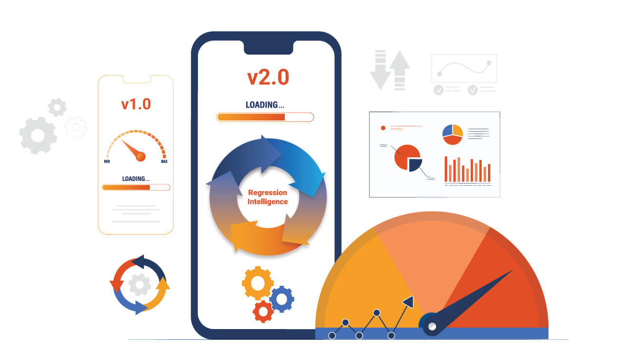
- Automated Cross-Browser Testing Tools: Employ automated testing frameworks that execute JavaScript within different browser environments. Selenium WebDriver, for instance, allows you to write test scripts that can interact with web pages across various browsers as a real user would. This helps in identifying JavaScript-related issues early in the development cycle. Integrating these tests into your CI/CD pipeline ensures continuous validation of cross-browser compatibility.
Also Check: Decoding Appium No-Code Test Automation With HeadSpin
4. CSS Compatibility Issues
CSS compatibility issues represent a formidable challenge in the realm of cross-browser testing. The crux of the issue lies in the inconsistent support of CSS properties and features across various browsers. This inconsistency can manifest in multiple ways, from minor discrepancies in font rendering to major layout breaks that severely impact the user experience. Such variations are not just limited to different browsers but also extend to different versions of the same browser, further complicating the testing process.
Root Causes
- Vendor Prefixes: Historically, browser vendors introduced their prefixes for experimental or new CSS features before they became standardized. This practice leads to scenarios where web developers must include multiple lines of the same CSS property with different prefixes to ensure compatibility across browsers.
- CSS Property Support: Not all browsers update at the same rate, resulting in newer CSS properties not being supported in older versions. This lag can cause a website to look and behave differently across browsers.
- Rendering Engines: Many browsers use various rendering engines (e.g., Blink, Gecko, WebKit), and each engine interprets CSS rules in its own way. This difference in interpretation can lead to variations in how a webpage is displayed.
Solutions
- Normalize or Reset CSS: Implementing a CSS normalization or reset stylesheet can mitigate inconsistencies by providing a clean slate across browsers. These stylesheets aim to level the playing field by resetting margins, paddings, and other properties to a consistent baseline.
- Vendor Prefixes Management: Tools like Autoprefixer automate adding vendor prefixes to your CSS, ensuring your styles work across different browsers without manually adding prefixes for each property.
- Feature Detection: Feature detection libraries like Modernizr to identify whether a browser supports a particular CSS feature. This approach allows you to write conditional CSS or JavaScript that only activates certain styles if the browser supports them, providing fallbacks for older browsers.
- CSS Fallbacks: Provide fallback styles for newer CSS properties that are not universally supported. This method ensures that the website will still render visually acceptable even if a browser does not support a specific feature.
Read: Browser Sandboxing - What is it, and why do we need it?
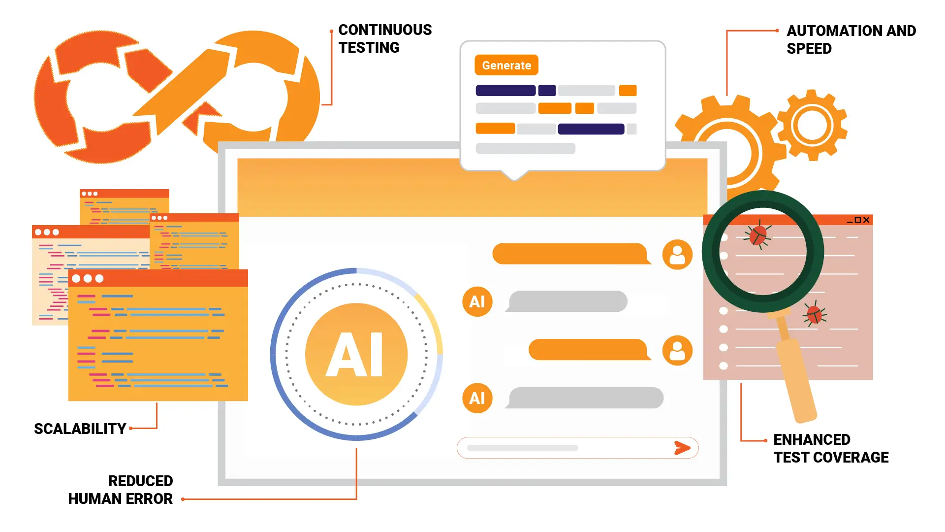
Utilizing HeadSpin for Cross-Browser Testing Efficiency
HeadSpin provides a robust platform that enhances cross-browser testing through several key features:
Global Device Cloud: Offers access to an extensive range of real devices worldwide, enabling precise testing across browsers and devices.
Real User Conditions Simulation: Simulates various network conditions and locations, offering insights into app behavior in actual user scenarios, crucial for optimizing experiences across all browsers.
AI-Powered Analytics: Uses AI to analyze test data, identifying performance bottlenecks and compatibility issues, thereby streamlining the optimization process.
Integration with Development Workflows: Easily integrates with CI/CD pipelines and development tools for automated testing and continuous monitoring, maintaining compatibility without disrupting workflows.
Conclusion
Cross-browser testing ensures that web applications deliver a consistent and high-quality experience across all browsers and devices. While the challenges are significant, adopting strategic approaches and leveraging the right tools can greatly alleviate these hurdles. Emphasizing cross-browser compatibility from the onset of the development process not only enhances user satisfaction but also contributes to the long-term success of web applications. With continuous evolution in technology and user preferences, staying informed and adaptable is critical to overcoming the complexities of cross-browser testing.
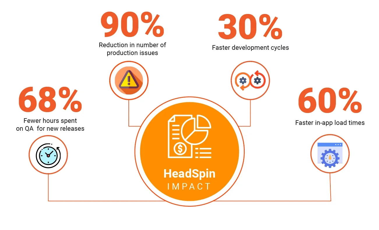
HeadSpin significantly simplifies the cross-browser testing process, offering a comprehensive suite of tools for testing accuracy, performance optimization, and team collaboration.
FAQs
Q1. When should cross-browser testing be performed?
Ans: Cross-browser testing should be integrated into the development cycle as early as possible. Ideally, testing begins during the development phase and continues through all stages of the project lifecycle, including after updates or releases. Early testing helps identify issues before they become costly or complex to resolve.
Q2. How do I handle testing for deprecated browsers?
Ans: While it's essential to focus on current and popular browsers, supporting older or deprecated browsers may be necessary for specific audiences. In such cases, prioritize critical functionality and accessibility over achieving an identical experience. Use conditional comments or fallback options for features not supported by these browsers.
Q3. Is there a standard checklist for cross-browser testing?
Ans: There isn't a one-size-fits-all checklist, as the requirements vary based on the specific project and target audience. However, a comprehensive testing checklist typically verifies layout and design, functionality, user interactions, form submissions, accessibility features, and performance across the selected browsers and devices.

-1280X720-Final-2.jpg)