.png)


.png)


AI-Powered Key Takeaways


Welcome to the final of a two-part series, "Regression Intelligence practical guide for advanced users"! In Part 1, we walked through the practical use of Regression Intelligence and Grafana through setting up custom KPIs and alerts. In this final series, you will learn about statistical hypothesis testing to solve network latency using Regression Intelligence. Many readers of this blog would have a solid knowledge of networks. However, I suppose not many realize the importance of statistical hypothesis testing in catching regressions. To see, here is a question for you! How would you answer the following question?
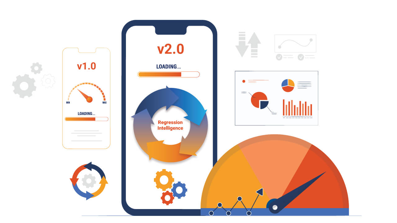
Q) Given v1.0 and v2.0 of a mobile application, you compared the two builds to see performance differences on a specific operation. The result showed that v1.0 took 44s and v2.0 took 54s; v2.0 took 10s longer on average. Can we say a regression occurred?
Perhaps some people will say, "No problem, if it is only 10 seconds", while others will say, "No, no, it's a regression because it increased by an average of 10 seconds". And some might say, "Try another test to see if the gap disappears". Opinions are divided…
Check out: Why Understanding Regression Defects Is Crucial
In the first half of this blog, I will introduce the statistical concepts that lead to a logical answer to this question. In the second half, you will configure Regression Intelligence and implement the concepts learnt in the first half. Toward the end, you will be exposed to powerful comparison and prediction methods that you can utilize in your network investigation and beyond.
Below are the topics covered in this blog.
- What is Network Latency?
- Normal distribution and Interval Percentages
- Find an optimal threshold
- Continuous monitoring and random samples
- Comparison and Prediction
- Summary
Excited? Let’s take a look at the first topic!
What is Network Latency?
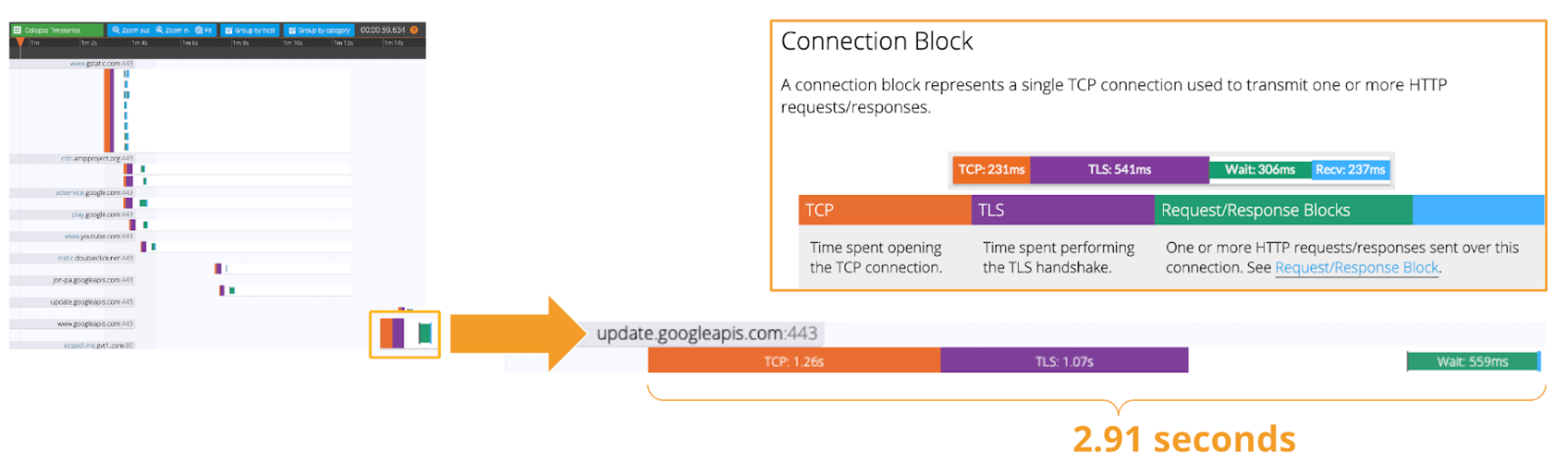
Network Latency generally means the time it takes for a data packet to travel back and forth between the client and server. When capturing network traffic with HeadSpin, round-trip times can be collected in detail for each HTTP/HTTPS transaction. See the diagram below, which shows the time taken to complete a transaction and its breakdown by waiting type. In this case, 2.91s counts towards Network Latency (KPI).
When applications and services send and receive large packets, even slight delays on a transaction-by-transaction basis can result in perceived slow performance and stress users. The impact of network latency on business differs across industries and business sizes, but here are some examples:
- Every 100 milliseconds of latency costs 1% in sales (source: Amazon)
- Every 100-millisecond delay in website load time can hurt conversion rates by 7% (source: Akamai)
- An extra 0.5 seconds in search page generation time dropped traffic by 20% (source: Google)
- Around 70% of apps are abandoned by users if they take too much time to load (source: Think Storage Now)
Some of my customers have said:
- Chronic delays caused by the rapid increase in teleworking hurts employees' work productivity.
- Fear of regressions and delays caused by infrastructure upgrades results in a loss of business agility.
- The lack of a mechanism to quickly and accurately catch the date, time and location of delays make troubleshooting costly.
- Poor application performance leads to lower customer satisfaction and brand dilution.
Track performance-related issues throughout the mobile app lifecycle. Know more.
None of the above can be ignored. As you know, today's networks are complex and global, consisting of diversely connected technologies such as VPNs, ISPs, CDNs, 4G/5G, Cloud and Edge and more. How can delays and anomalies in this vast network, which can occur anywhere at any time, be detected? The answer is continuous data collection.

The purpose of data collection in latency detection is to figure out the valid values of your network when healthy. Once you know what valid values for your network are, you can determine whether the network is in good or bad condition by looking at numbers. But the question is, what defines the “valid” values you think are valid? That’s where statistics comes into play! In the next topic, I will explain how to create and read the normal distribution needed to identify these valid values.
Check out: Why is Outsourcing Mobile Testing a Better Option?
By the way, this is off-topic, but it’s best to use automation in data collection, as it requires a large amount of data to identify the optimal state of your network. Also, to collect realistic results, automation should run on the user's edge device (e.g. mobiles, browsers). Here is a link for a recommended course to learn the basics of Appium and Selenium.
Normal Distribution and Interval Percentages
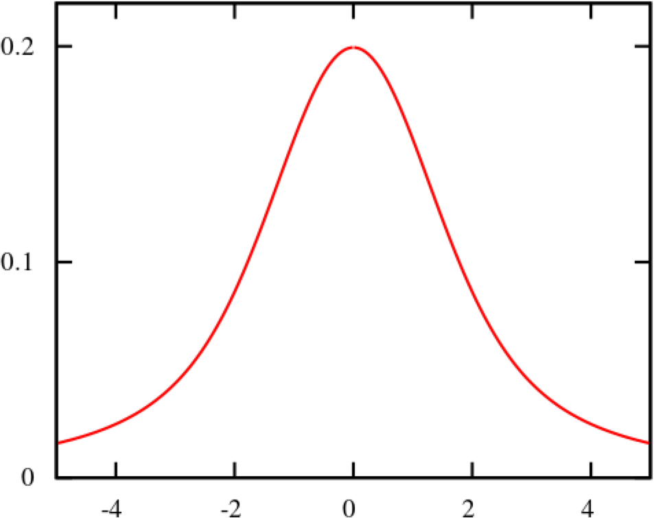
The normal distribution is the most important probability distribution for understanding statistics. The name comes from the fact that it is a probability distribution that applies well to various phenomena such as "normal" (= "commonplace" or "normal") nature and human behaviour and characteristics. The graph is a symmetrical (bell-shaped) curve, as shown in the diagram below.
All events handled by HeadSpin fit this normal distribution. Even if there are some exceptions, when the population grows to a certain extent, it is known to approach a normal distribution according to the Central Limit Theorem. Follow the link to know the theory better. For now, no more difficult words! We will create a normal distribution based on Network Latency (KPI) and see it!!!
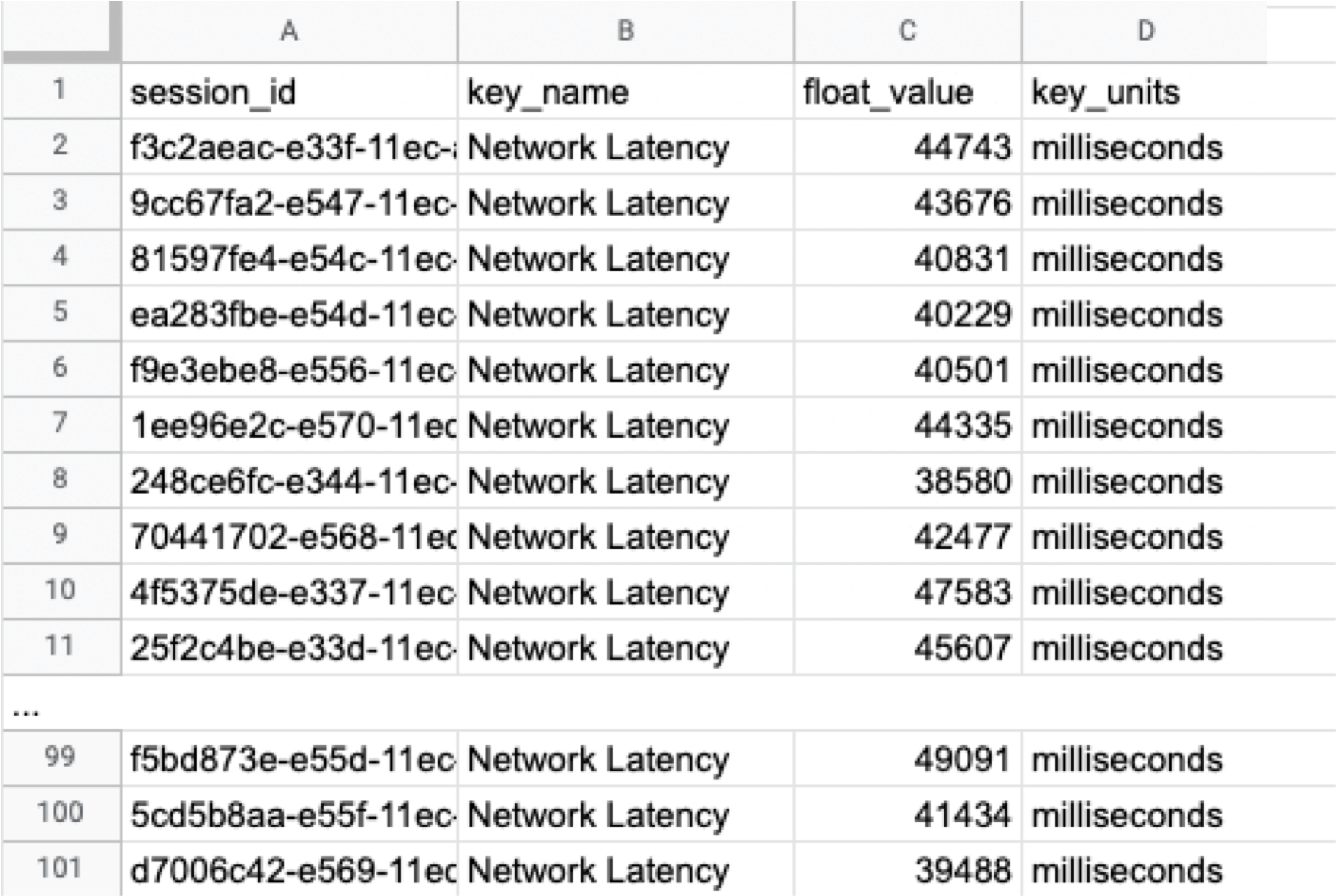
The following instructions assume you have a "regression analysis" user flow that already exists which stores 100 sessions tagged with “build:1.0”. The first step is to extract the Network Latency (KPI) from the Postgres database. Use the following SQL for retrieval. For information on how to access the Postgres DB, check here.
Below is the result of running SQL above, which can also be accessed here as sample data.
Next, we will compute the average and standard deviation of the Network Latency in column C. Only these two parameters are required as input to produce a normal distribution later. Here, we will use Google Sheet to run some math. See the image below showing how to calculate the average and standard deviation in columns G and H, respectively.
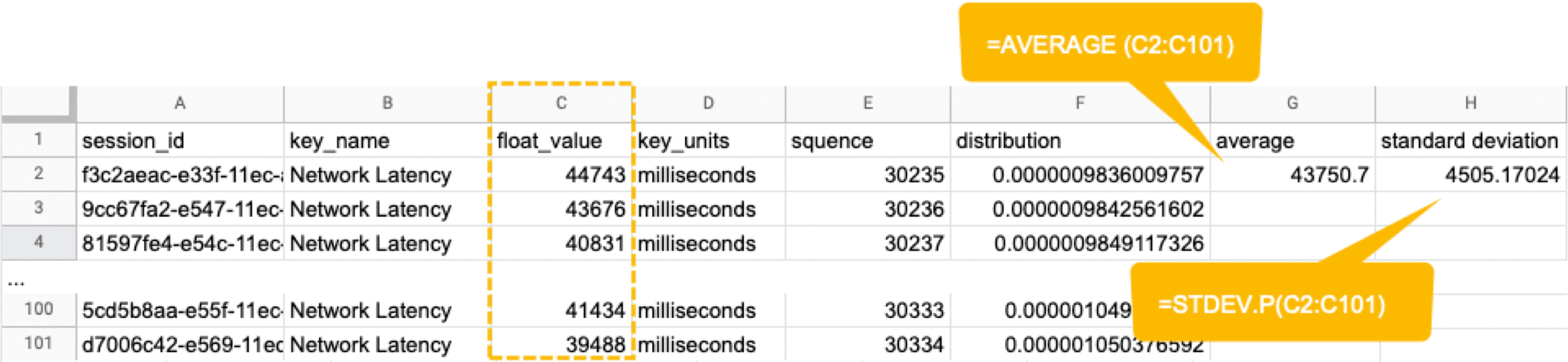
By the way, have you ever wondered what the standard deviation is? It is a magic number. It tells us how far away from the average value, the data points are scattered. The calculation is simple and can be done manually; you subtract the average value of 43750.7 from each value in column C, sum up all, and divide the sum by the total number (in this case, 100). Got the idea? The larger the standard deviation is, the further away from the average value the data you have in hand are. That’s all we need to know.
Read: Why should businesses focus on Test Data Management
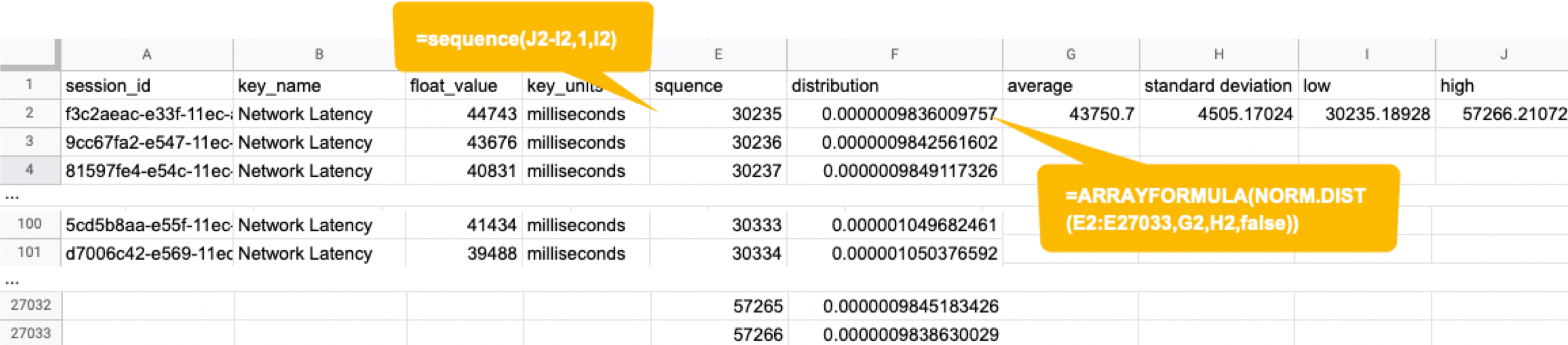
Next, in the columns G and F, we enter the numbers representing the bell shape's leftmost (minimum) and rightmost (maximum). They will be used later when creating the chart. You will shortly know why we use the population average ±3*(Standard Deviation) in the formula.

Next, add the E and F column: In the E column, you assign a serial number that increases by one from low to high. Then, in the F column, enter the result of the Norm.Dist function, which we will convert to a normal distribution next. The Norm.DIST function takes two parameters as input, the average value and standard deviation. The final numbers in column F mean the probability of each KPI value in column E.
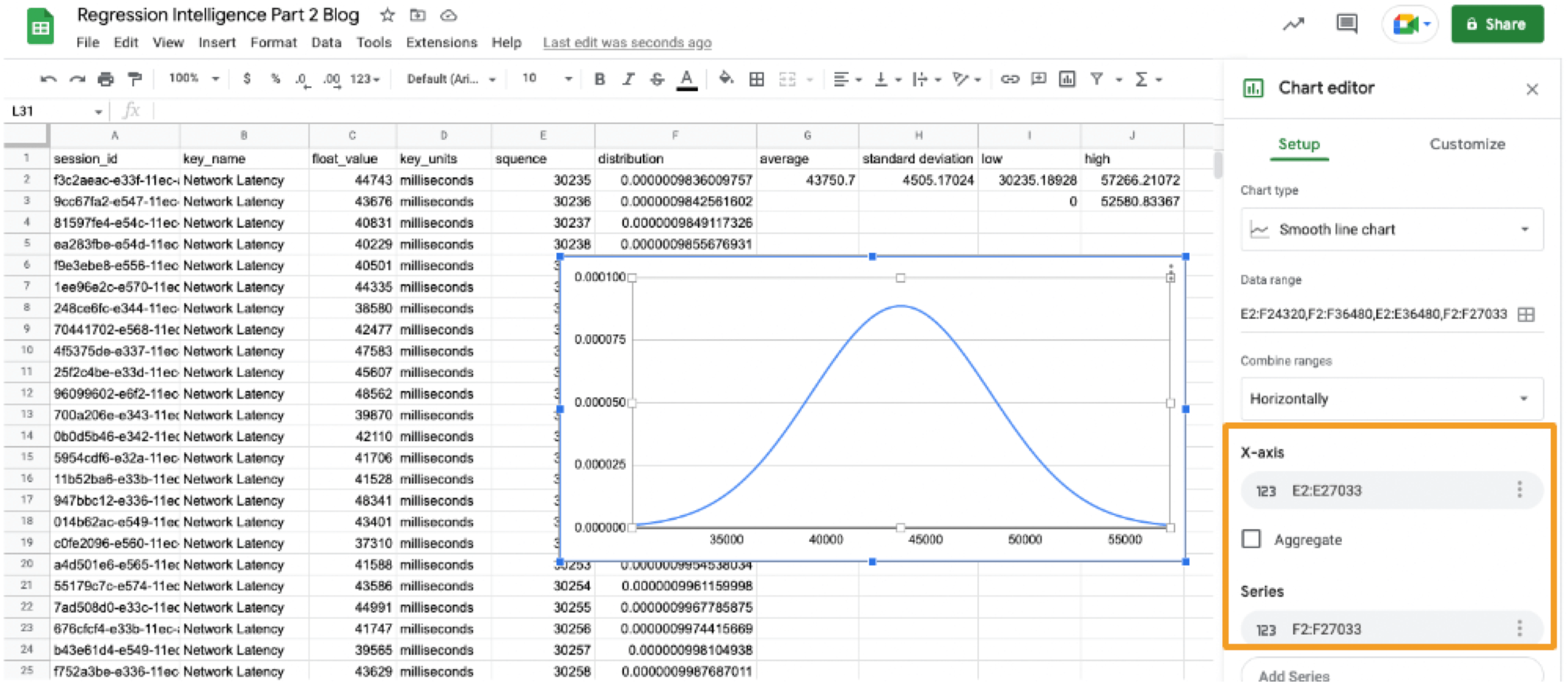
Finally, select all values in E and F columns to create a "Smooth line chart". This produces a normal distribution, as shown below.
So what does this normal distribution tell us? Looking at this chart, you can tell the probability that specific network latency will occur. For example, the likelihood of a network latency of 60 seconds to occur is less than 0.3%. Where does 0.3% come from? See below.
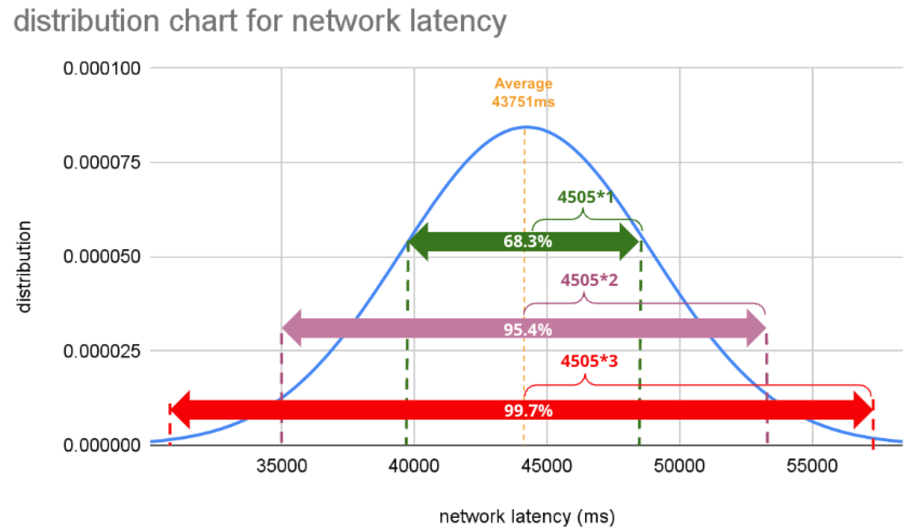
There is a known truth (called 68-95-99.7 rule) about the normal distribution. That is if we know how far away from the population average the individual data is, in standard deviation units, you can determine the rarity of the data. Don't think too much but remember the three commonly used intervals and their probabilities (=interval percentages), which are presented below:
- (Population Average) ±1*(Standard Deviation): 68.3%
- (Population Average) ±2*(Standard Deviation): 95.5%
- (Population Average) ±3*(Standard Deviation): 99.7%
What we want to do next with these interval percentages is to find an optimal threshold that we can use to determine if a regression has occurred. Only then we will be able to tell from the numbers what is normal and abnormal.
Find an optimal threshold.
In Part 1, we set the "unacceptable battery usage" KPI threshold to 10% with no logical reason. Often, relying on feeling or intuition in determining a threshold is not a good idea. Thus we use statistics. So the question is, how can we find the statistically correct threshold? To know the answer, you need to understand four concepts; significance level, confidence interval, critical point, and rejection region. Sounds hard? Not at all. See the diagram below.
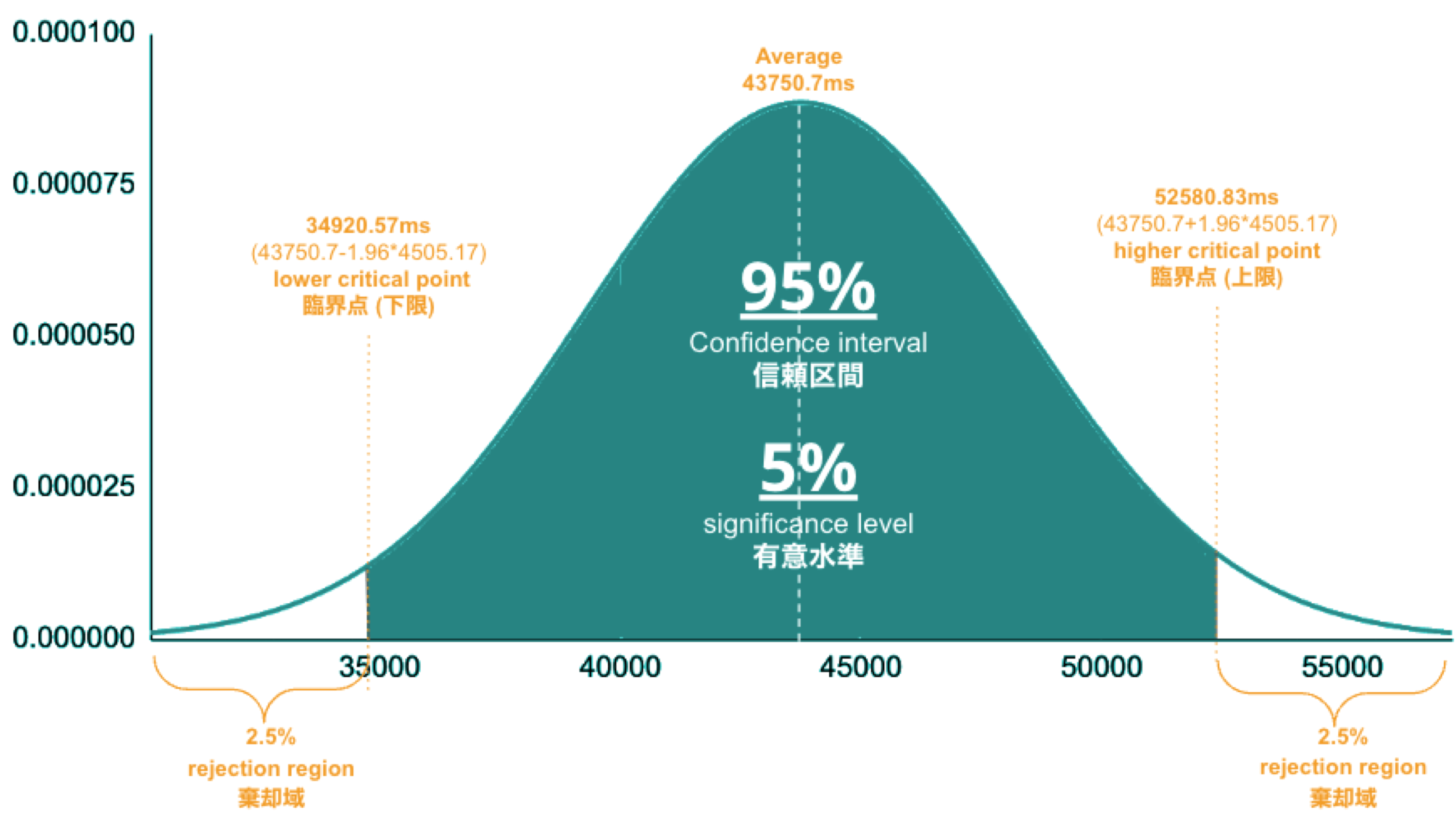
- Significance Level is the value you need to come up with. If it's.set to 5%, it means you are willing to tolerate up to a 5% chance of a false positive.
- Confidence Interval is 100% minus the significance level. If the significance level is 5%, the confidence interval is 95%, representing the green area in the image. The statistics indicate that 95% of the data will fall within this range.
- Critical Point is the boundary line you use to judge whether an anomaly has occurred or not. You will calculate it using the formula, the population average ± 1.96*(Standard Deviation), and the results are 34.9s and 52.6s in this case.
- Rejection Region is the white area beyond the critical point. If a sample average (see “Table: sample average and population average”) occurs in this area, you immediately consider the regression or anomaly.
Alos read: Fundamentals of Test Harness
So, the correct way to find an optimal threshold is three steps; 1. create a normal distribution from the large data you collected from your network, 2. decide your significance level, and 3. figure out a critical point in your distribution. In this example, 52580.83ms (≈52.6 s) is the threshold we care for setting alerts later.
Now, let us return to the question posed at the beginning.
Q) Given v1.0 and v2.0 of a mobile application, you compared the two builds to see performance differences on a specific operation. The result showed that v1.0 took 44s and v2.0 took 54s; v2.0 took 10s longer on average. Can we say a regression occurred?
A)The answer is YES if the significance level is 5%. It is because If the significance level is set to 5%, the upper critical point is 52.6s, and 54s falls in the upper rejection region; hence the 10s gap is considered a significant difference. But if the significance level is 1%, the answer is NO because the upper critical point shifts to 57.3% and 54s can stay inside the confidence interval; hence the 10s gap is not considered significant. Remember that the outcome will thus vary depending on the significance level you set.
The hypothesis testing method used here is called Z-test in the statistics world; Z-test is a type of statistical hypothesis testing that uses a normal distribution. This concept has been applied in various fields, including economics and medicine. It is an efficient concept, so if you don't know about it, this is an excellent opportunity to master it. We have explained this without using complicated terminology, but if you would like to know more about Z-test, please search "Z-test", "null and alternative hypotheses", and "statistical hypothesis testing".
Accelerated Development with Data Science Insights for Enterprises. Learn more.
Moving on, we will set alerts using the optimal threshold identified and learn some more statistics concepts.
Continuous monitoring and random samples
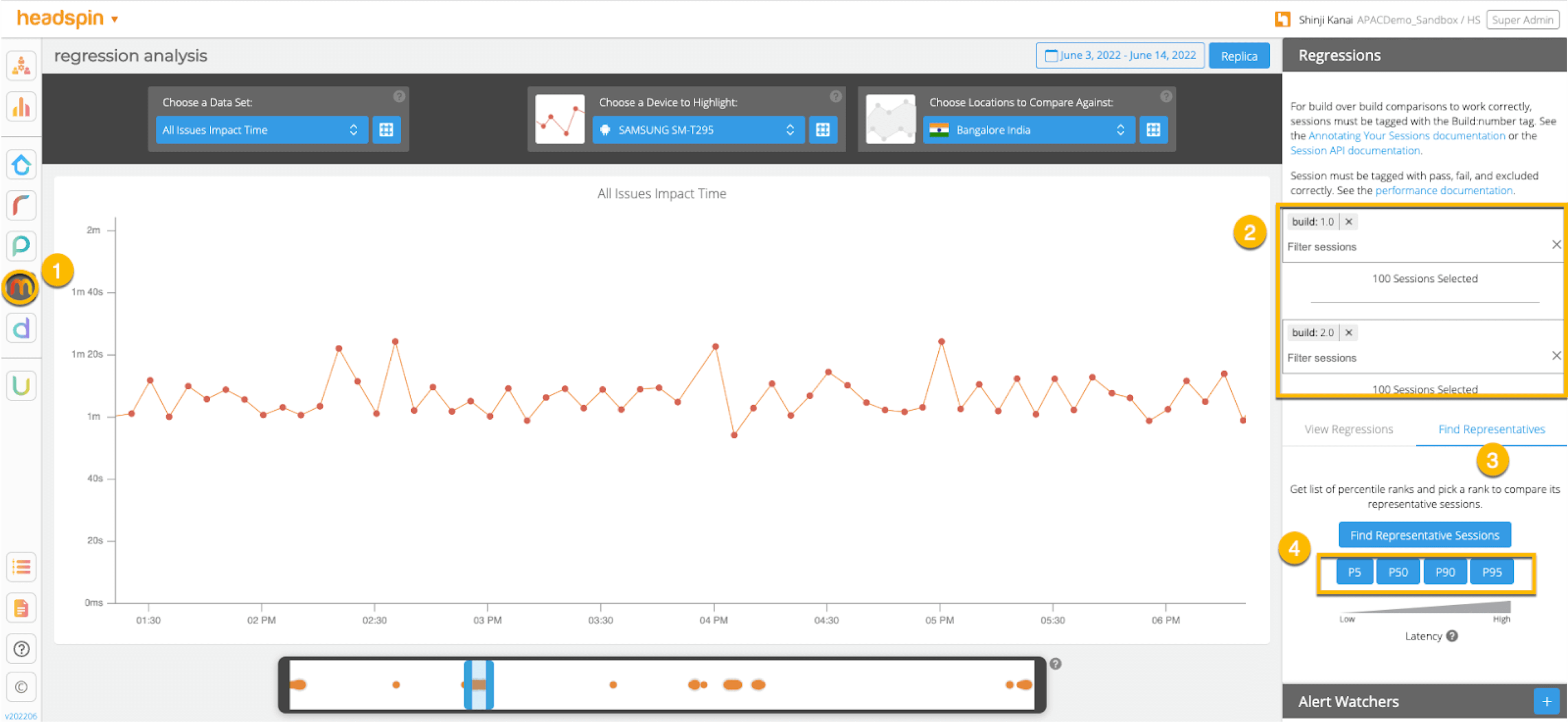
In this section, we will set up regression alerts and implement continuous monitoring via Web UI; please refer to Part 1 for setting a watcher via the API and applying it to custom KPIs other than ‘summary.network.regression.”Network Latency”’. As of this writing, the Web UI only supports the "Network Latency" KPI for regression tracking. Navigate to a user flow and follow the diagram below to set alerts. For selector and cron expression, refer to the relevant tables in Part 1.
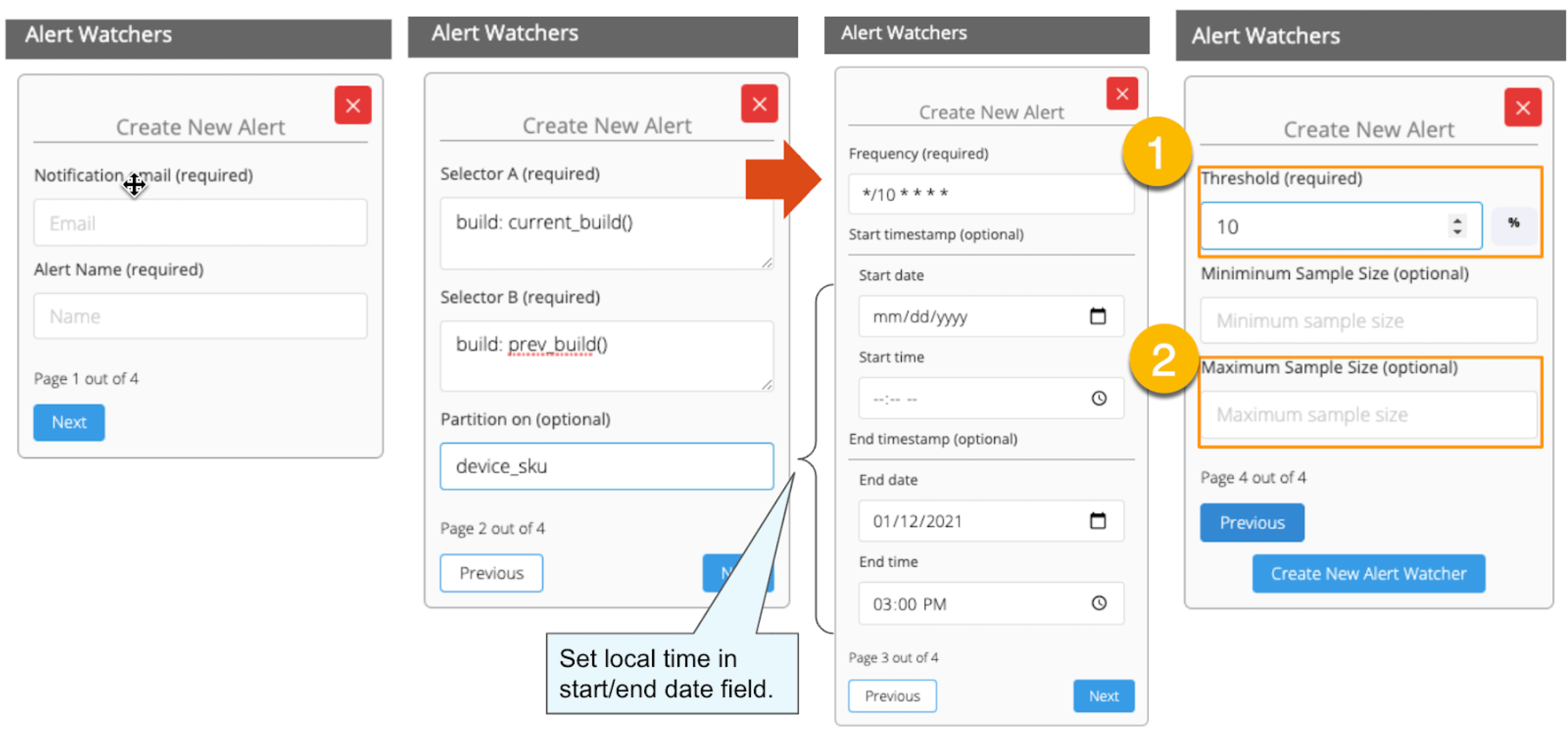
1. The threshold value is 5%, calculated using the following formula:
population average / (upper critical point - population average) = 43.8s / (52.6s - 43.8s) ≒ 5%.
2. Maximum Sample Size is the sample/limit size, the number of sessions to analyse. The default value for limit size is 15. You may wonder, “Why 15? Can it be set higher?”. This answer is closely related to statistics, so let me answer it below in detail.
A) As you guess, the higher the number of sessions included in the analysis, the better the accuracy is. You can achieve the best accuracy by having the entire population included in the analysis; this is called a "full survey" as opposed to a "sample survey". Doing a "full survey" prevents the intrusion of a "sample error", which is the difference between the sample average and the population average. However, in many cases, the population tends to be very large. The analysis time can exceed tens of minutes or an hour if the sample size exceeds several hundred or even thousands. This often makes it not ideal to carry out a "full survey". Not only that. The population sizes fluctuate over time. The sessions being 100 today will be 200 tomorrow. You can increase the limit size programmatically, but not a good idea from a maintenance and operation perspective. A "sample survey" approach is therefore preferred. The concept of random sampling is essential to minimise "sample error". One well-known statistical truth is that "the average of randomly selected samples approaches the population average". The diagram below illustrates this concept in an intuitive and easy-to-understand manner.
Table: sample average and population average
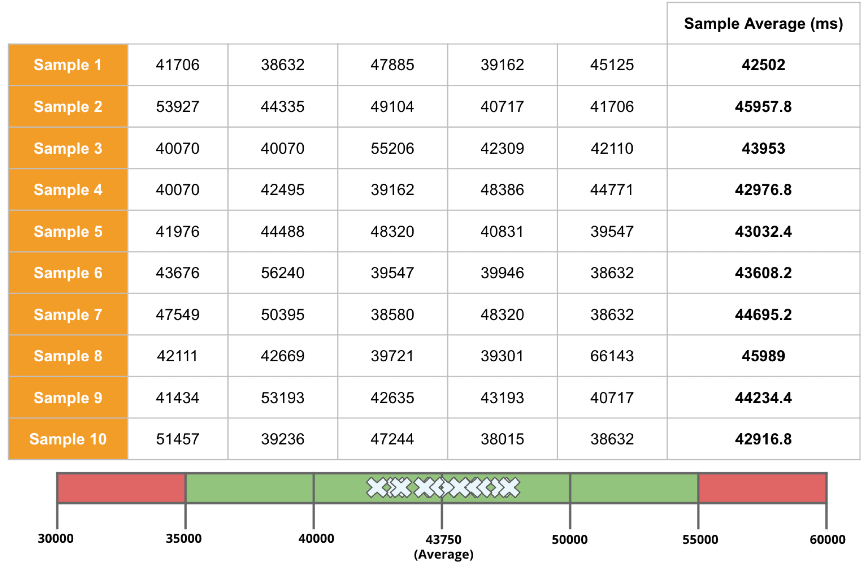
In the example above, the sample size is 5. There are 10 sample averages, and you see them all gather near the population average of 43,750ms. Regression Intelligence pseudo-randomly picks 15 samples by default.
The “pseudo-randomly” means as long as the tag/selector and the size of the population remain unchanged, the same sample will be selected each time; if new sessions are added to ‘a' or ‘b', the sessions selected will change, even if the same selector is specified. This prevents the intrusion of human bias in the selection process. Source: Regression Intelligence practical guide for advanced users (Part 1)
In most cases, a sample size of 15 is reasonable. The best is to run a “sample survey” every time the population changes or simply run it continuously. If the sample average enters the rejection regions (the red area), you can safely say that a regression has occurred.
Now let’s put the pieces together. Here are three key factors that determine the chance of catching regressions:
i. Threshold
ii. Sample Size (default: 15)
iii. Frequency
In most cases, the limit size of 15 is sufficient, so there should be little need to tweak (ii), so you will be mainly adjusting (i) and (iii). My advice for finding an optimal threshold is to understand your distribution chart well, know your significance level, and set the threshold on the critical point identified. For sampling frequency, you should understand how fast your population grows and set the frequency to pursue the growth. I hope these tips help. Continuous monitoring has many benefits beyond what I described in this blog. Below is the additional reading for those who want to know more.
Read more: The Increasing Need for Performance Testing in Web Applications
In the last section, I will introduce some statistics-backed features that help you pinpoint the source of regression.
Comparison and Prediction
After receiving an alert that a regression has occurred, what do you do next? You will probably start analysing the cause of the degradation. Nothing happens if nothing changes. In other words, if the regression has occurred, something must have changed. Here are three statistics-backed methods that can help you track and predict regressions of any KPI metrics, not just network latency.
1. Percentile
In the product documentation, “percentile” is defined as follows:
"percentile" (optional): The two sessions most closely matching the specified percentile in total network latency will be selected for comparison. Note that "percentile" is not currently compatible with selecting a custom "kpi". Example: 50 (the median)
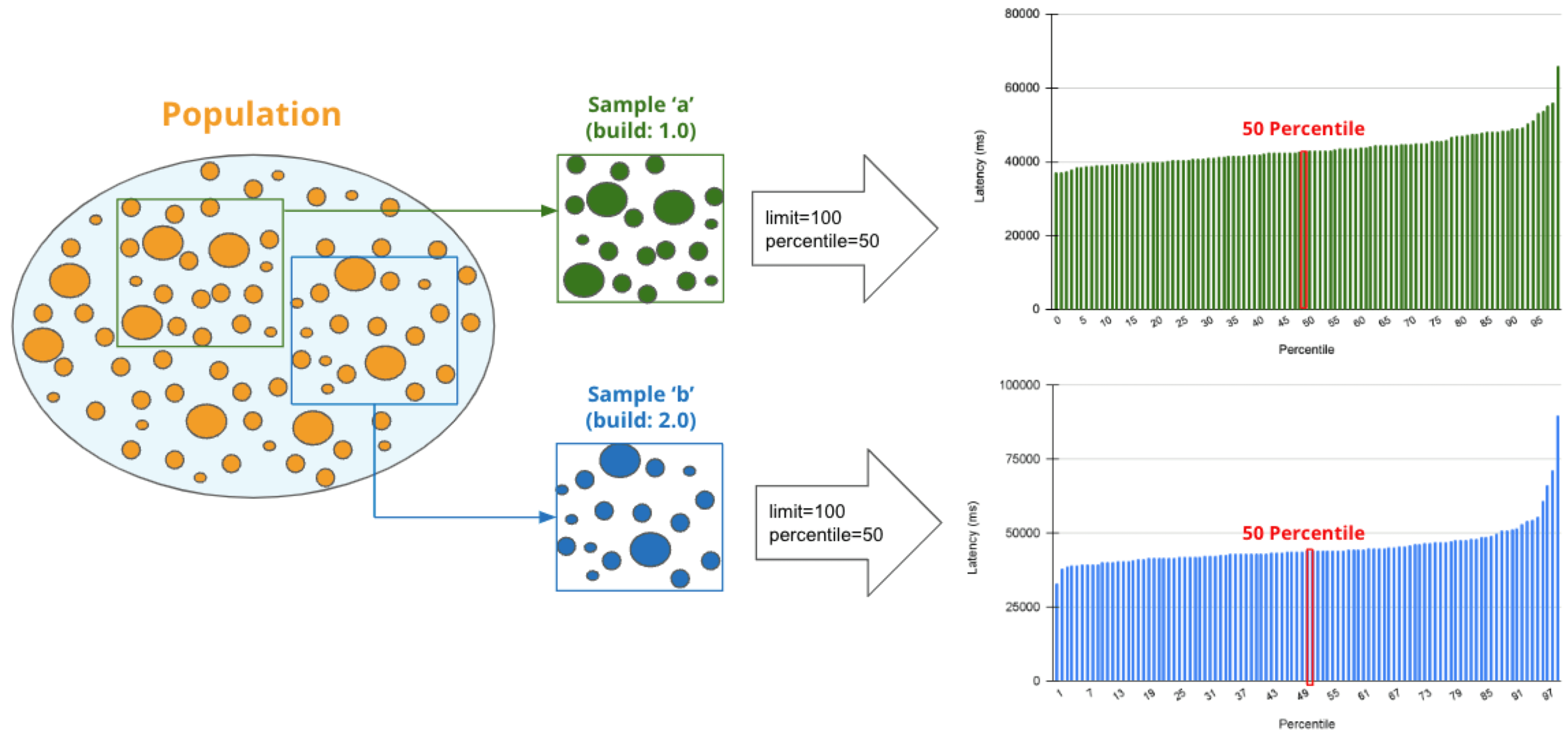
Percentile is a statistical term describing the percentage of sessions that are sorted in order from the smallest to the largest. For example, if you generate a regression report with a "50% percentile", Regression Intelligence will rank the sessions from smallest to largest based on Network Latency KPI and choose the sessions with exactly 50% from the smallest. The diagram below shows how the sessions at 50% for groups 'a' and 'b' are selected.
The golden rule in comparisons is to compare two items with few differences. If the difference is too large, there are too many distinctions, and you can't notice a subtle change that has caused the regression. No one would bother to compare an apple and orange, right? Also, note the more data you have to analyse, the more difficult it becomes to find the two with the slightest differences. Percentile helps you find the best match for comparison.
Also check: Root Cause Analysis for Software Defects
Below is how to compare the two sessions on the 50% line in groups 'a' and 'b'. There are two approaches; Web UI and API.
Creating regression reports specifying percentiles (WEB UI)
Creating regression reports specifying percentiles (API)
API Result:
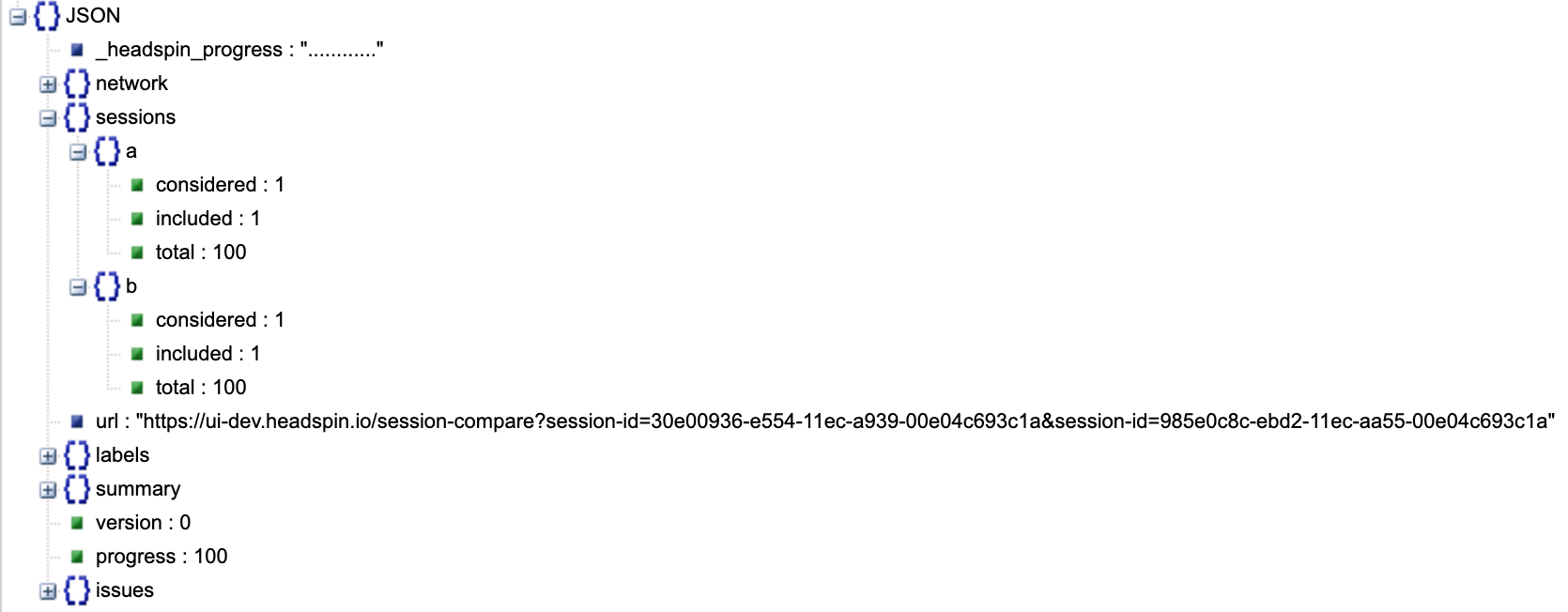
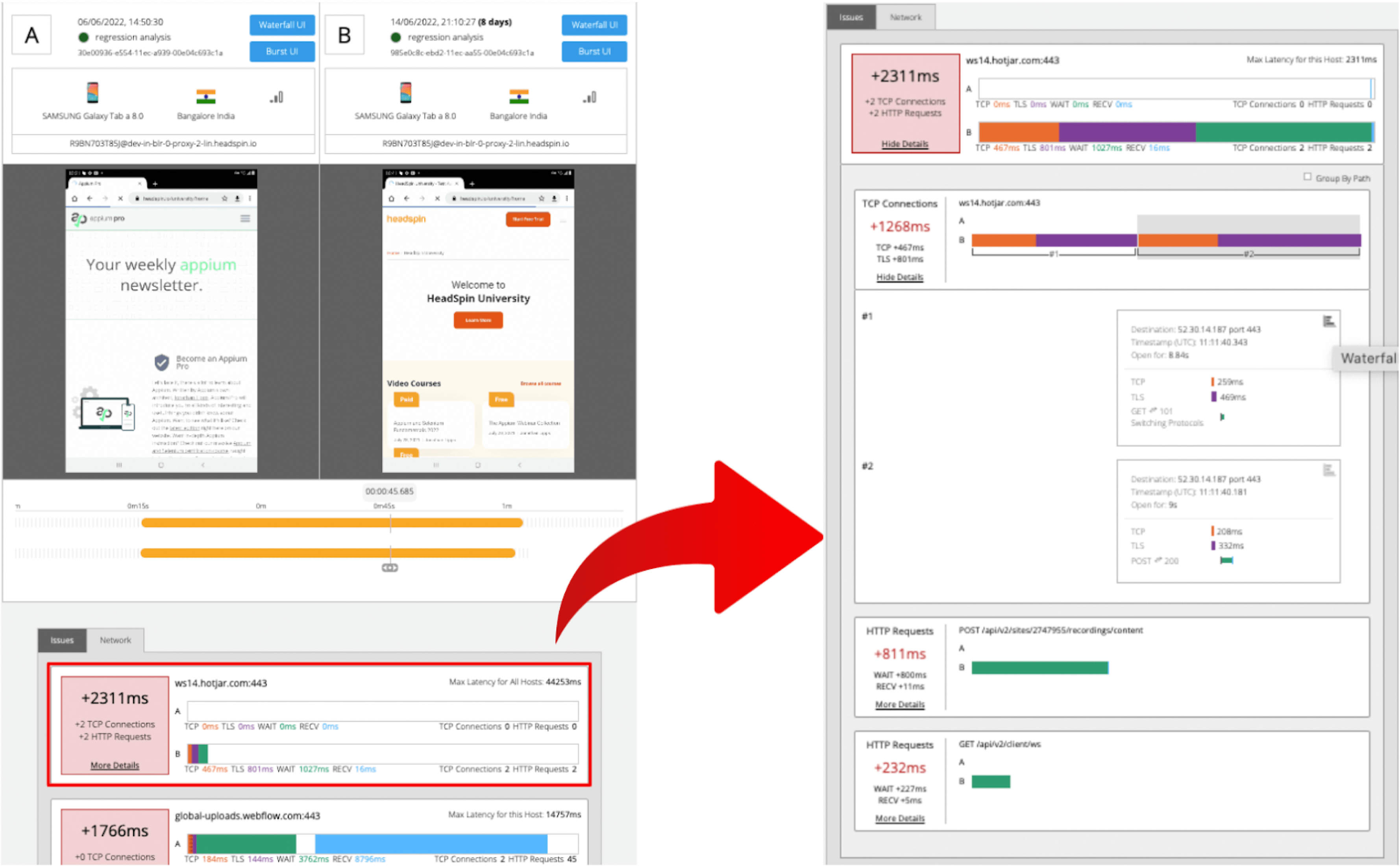
The JSON returned by the API contains a link to the web UI and details of the analysis results. Clicking on the link will display two sessions in the same percentile next to each other. The diagram below shows that the session on the 'a' side has no calls made to "ws14.hotjar.com" host. As the tool clearly shows the gaps exist, you can open up other tools or debuggers for further verification when it becomes necessary to dig deeper. Regression Intelligence's beauty is that it brings this deep, hidden insight into your awareness.
2. Percentile Rank
In the product documentation, “percentile rank” is defined as follows:
"percentile_rank" (optional): If provided, the corresponding percentile will be estimated for each metric independently, before performing the final comparison that determines regression status. (e.g., percentile_rank = 50 will estimate the median for each metric).
By default, a regression report returns the average of the sampled values. With the "percentile rank" parameter set to say 50%, the report will show the values found in the percentile of 50%. See the image below that depicts how this feature works. Both highlight network-related values, but the left shows the average values, and the right shows the 50th percentile values.
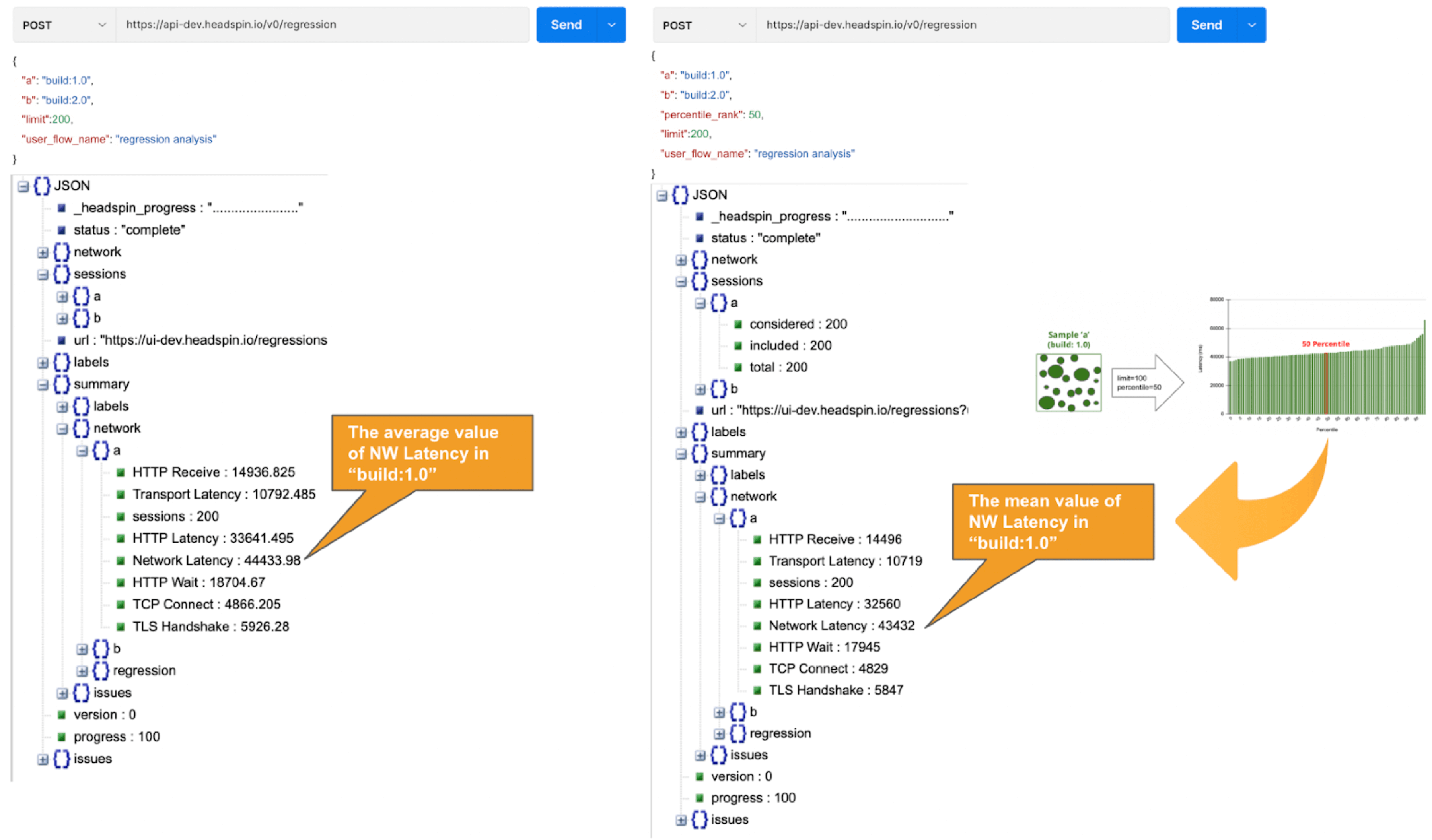
*If the API takes a long time, use the asynchronous endpoint (/v0/regression/worker).
Using percentile ranks, you can quickly discover where a given value resides within the entire population. For example, if you want to know the value in the top 15% of the population, you can specify the 85% percentile. I specified the 85th percentile for my population and the result was 48 seconds. Since the population average is 43s, it means if network latency is 5s or greater away from the average line, that will put the values in the top 15% box.
Test and monitor websites & apps with our vast real local devices across the world. Learn more.
Also, you can collect the average and percentile values per domain. This is useful to know, for example, when estimating approximate confidence intervals and rejection ranges specific to each domain. In the example below, you can see that the network latency for the hostname "appiumpro.com" fluctuates between 193 ms (bottom 5%) and 395 ms (top 5%). This insight helps you identify response time trends for specific domains.

3. Correlation and Prediction
By visualising and comparing the collected data from different angles, you can get a complete picture of the relationships between various KPIs. By looking at the big picture, you will notice the hidden insights or patterns within the data that lead to finding business threats or opportunities lurking somewhere. You can use the standard plots and Grafana for this purpose.
Use the plot feature to inspect correlations between KPIs over time.

Use Grafana dashboards to visualise the correlation between network delays and business KPIs.

Once the relationships between the data are known, it will be possible to determine what factors to pay attention to or actions to take. For example, suppose there is a rightward or leftward relationship (strong relationship) between the time series on the X-axis and the KPI on the Y-axis. In that case, it is possible to predict the future if the cycle can be determined using the FORECAST function. This is just an example. You can also export all time-series data collected from HeadSpin to external analysis services and have them branded with other data sources to enable more advanced data analysis.
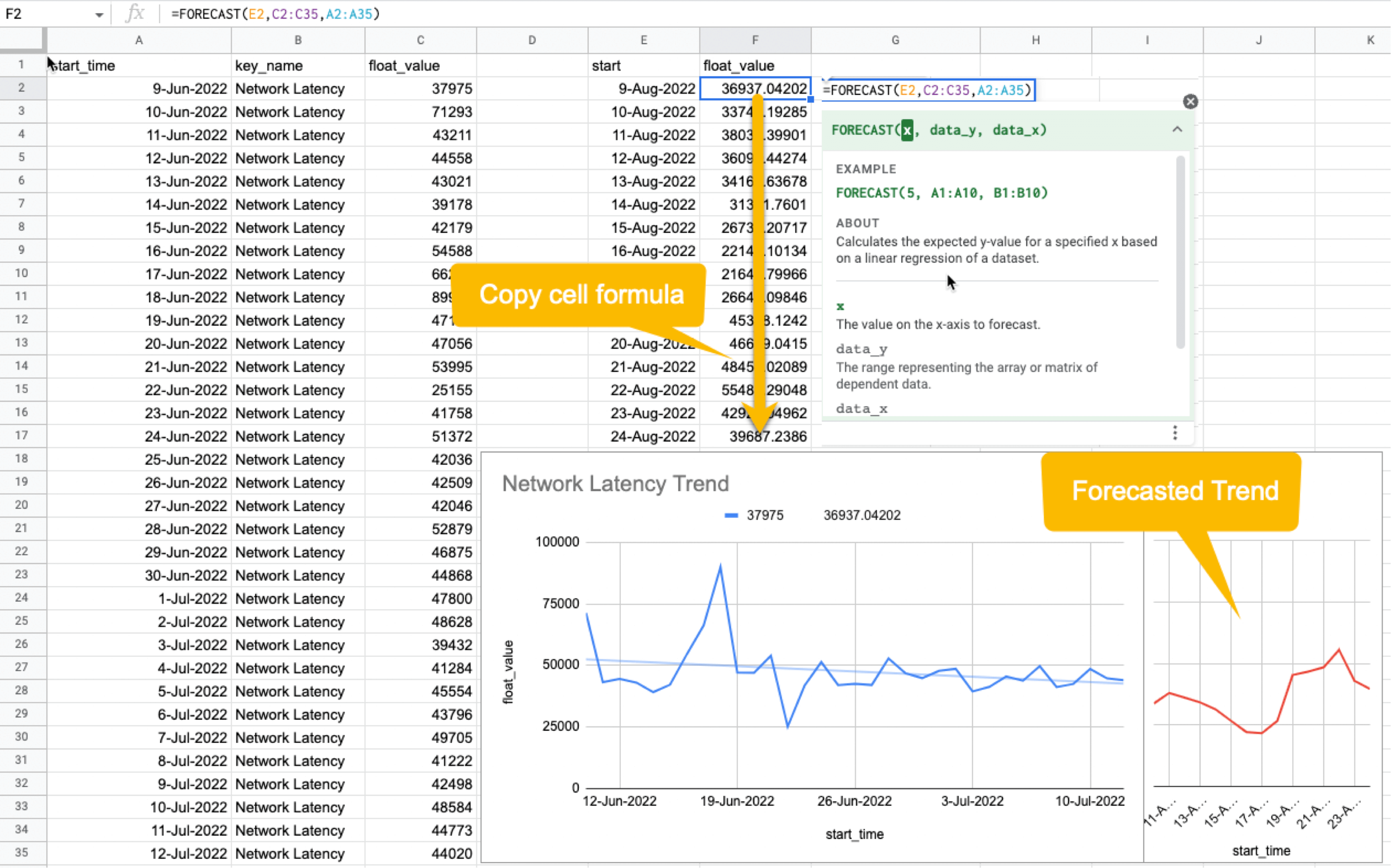
HeadSpin specializes in collecting data on a time series basis. Time-series data focuses on capturing the variability of the observed object over time. This is called fixed-point observation (observing values at a set time). Through continuous observation, you can uncover changes that would not be noticeable in everyday life, such as seasonal variations (e.g. growth in summer and decline in winter) or hidden cycles and patterns in energy consumption etc. This awareness may lead you to the next business opportunity.
Leverage digital experience monitoring capabilities for proactive resolution of app issues. Learn more.
Summary
I hope everything you need to know is covered. In this blog, you learned how to create a normal distribution from extensive data and find an optimal threshold, build a regression detection loopback powered by statistical hypothesis testing, reduce "sample error" with random sampling, utilize comparison and prediction functions, and more. It was a lot, but I hope you all find it useful. With the advent of next-generation technologies such as 5G and Web 3.0, networks will become even more complex and mission-critical in the coming years. By combining the power of statistics with Regression Intelligence learned in this blog, I am sure you will solve the challenges ahead. Thanks for reading to the end!


-1280X720-Final-2.jpg)