


.png)


.png)


AI-Powered Key Takeaways


The surge in mobile website activities has been unprecedented in the last couple of decades. Across multiple channels, users have shown a higher rate of participation and regular usage to explore the Internet. These rising demands for mobile websites make it crucial for businesses to focus on creating appealing, catchy, and engaging website designs with seamless UIs. Industry leaders like Google have long started supporting mobile-friendly websites by updating their ranking algorithms, indexing mobile sites, and conducting mobile-first indexing.
Mobile-friendly and responsive web designs are imperative, leading to improved user engagement, retention, and conversion rates, thereby driving business growth.
What is Mobile Website Testing?
Mobile web testing is the process of verifying how a website performs on mobile devices across different screen sizes, operating systems, browsers, and network conditions. It ensures that users have a consistent and usable experience, whether they’re on a high-end smartphone or an older device with limited connectivity.
This type of testing typically includes:
- Responsive layout checks: Making sure content adjusts appropriately on various screen sizes and orientations.
- Cross-browser compatibility: Ensuring the site looks and works the same across mobile browsers like Chrome, Safari, Firefox, etc.
- Touch interaction testing: Verifying that buttons, menus, sliders, and other interactive elements respond correctly to taps and gestures.
- Performance testing: Checking how the site loads over mobile networks (3G, 4G, etc.), and how it handles delays or slow connections.
- Functional testing: Making sure all features—like forms, navigation, and media—work as expected on mobile.
- UI/UX validation: Ensuring text is readable, buttons are accessible, and users can navigate comfortably on small screens.
- Security checks: Verifying secure connections (HTTPS), cookie handling, login flows, and protection of user data.
When is mobile web browser testing required?
In today's digitally-driven age, the prevalence of mobile devices is undeniable. From smartphones of varying sizes to tablets with distinct resolutions, the plethora of devices available has led to a surge in mobile web browsing. But with this rise comes a unique challenge for developers and businesses: How can one ensure a seamless web experience on all these devices?
Offering an optimal experience on a myriad of mobile devices is no easy feat. The diversity in screen resolutions and viewport sizes amplifies this challenge, adding multiple layers of complexity to the mobile website testing process. It isn't just about ensuring that a website is 'mobile-friendly' anymore. It's about ensuring that the website delivers a consistent and quality user experience, regardless of the device it's accessed from.
Different devices interpret and render web content in varying ways. What looks impeccable on one device might appear disjointed or misaligned on another. It's these nuances that make mobile website testing not just essential but imperative.
Methods to Perform Mobile Website Testing
There are several ways to test how a website performs on mobile devices. The right approach often depends on your team’s resources, the complexity of your site, and how many devices you want to cover.
1. Manual Testing on Real Devices
This involves opening the website on actual smartphones and tablets to test layout, performance, and usability. It’s the most accurate method, as it reflects real-world conditions, but it can be time-consuming and challenging to scale.
2. Testing on Emulators and Simulators
Emulators mimic mobile operating systems on a desktop, while simulators recreate browser behavior. These are useful during development and for quick checks, but they may not capture real device performance or network behavior accurately.
3. Responsive Design Testing in Browsers
Modern browsers like Chrome and Firefox offer developer tools that let you simulate different screen sizes and resolutions. While this doesn’t replace device testing, it helps catch basic layout issues early.
4. Automated Testing
Automation tools like Selenium, Appium, or Cypress can run predefined test scripts across various devices and browsers. These are ideal for regression testing and speeding up QA cycles, especially when integrated with CI/CD pipelines.
5. Cloud-Based Testing Platforms
Tools like HeadSpin offer remote access to a wide range of real mobile devices. This allows teams to test at scale without maintaining an in-house device lab. Many of these platforms support both manual and automated testing.
Importance of Mobile Website Testing
For businesses striving to make an impact, ensuring their websites function flawlessly on mobile devices isn't just a luxury – it's a necessity. Here's why mobile website testing should be at the forefront of any business strategy:
- Ubiquity of mobile devices: With the vast majority of the global population now owning smartphones, mobile browsing has overtaken desktop browsing in terms of volume. Businesses can't afford to ignore this massive user base.
- User experience matters: A site that isn't optimized for mobile can deter potential customers. Slow loading times, misaligned content, or unresponsive designs can lead to user frustration, impacting brand perception and customer loyalty.
- SEO implications: Search engines, like Google, prioritize mobile-friendly websites in their rankings. A site that isn't mobile-optimized can suffer in search engine results, limiting its visibility and reach.
- Diverse device landscape: The mobile world isn't homogeneous. With a multitude of devices, operating systems, screen sizes, and resolutions, what works perfectly on one device might be broken on another. Regular testing ensures consistency across all devices.
- Rapid technological evolution: The pace at which mobile technology evolves means new devices, browsers, and operating systems are continuously entering the market. Regular mobile testing ensures that businesses remain ahead of the curve, offering a seamless experience regardless of the device's age or specifications.
- Higher conversion rates: A mobile-optimized website that provides a seamless experience can drive higher engagement, leading to increased conversion rates. Whether it's signing up for a newsletter, making a purchase, or filling out a contact form, users are more likely to take action on a site that works flawlessly.
- Adaptability to mobile-first features: Mobile devices offer functionalities like geolocation, orientation, and touch that aren't typically available on desktops. Testing ensures businesses can harness these features effectively, offering enriched user experiences.
Challenges of Mobile Website Testing
Testing websites on mobile devices comes with its own set of complexities. Unlike desktop environments, mobile testing needs to account for a broader range of variables, making it harder to catch every possible issue before release.
1. Device and OS Fragmentation
There are hundreds of devices on the market with varying screen sizes, resolutions, hardware capabilities, and operating systems. Ensuring consistent behavior across this fragmented landscape is a significant challenge.
2. Browser Compatibility
Mobile browsers differ not only across platforms (Android vs. iOS) but also in how they interpret HTML, CSS, and JavaScript. Some features may work in one browser and break in another.
3. Varying Network Conditions
Mobile users often switch between Wi-Fi, 4G, and even low-speed networks like 2G or 3G. Testing how a site performs under these fluctuating conditions is critical but complex to simulate without proper tools.
4. Touch and Gesture Support
Websites need to support tap, swipe, pinch, and other gestures. Elements must be appropriately sized for fingers, and interactive areas need to be tested for both responsiveness and usability.
5. Limited Testing on Real Devices
Building and maintaining an in-house device lab is expensive. Teams often rely on emulators or a limited set of devices, which may not uncover all issues faced by actual users.
6. Performance Constraints
Mobile devices typically have less memory and processing power than desktops. Heavy pages, unoptimized media, or excessive scripts can slow down the site or crash the browser.
7. Battery and Resource Usage
Websites that excessively consume battery, data, or CPU can negatively impact user experience. These issues are complex to detect without specialized monitoring tools.
Best practices for mobile website testing
Ensuring good user experience on mobile devices requires following key best practices for mobile website testing. These practices help optimize performance, functionality, and user experience across various devices and platforms. Here are some best practices to follow:
1. Test across multiple devices and browsers
Mobile devices have varying screen sizes, resolutions, and operating systems. Testing your website on a diverse range of devices and browsers is crucial to ensure compatibility. HeadSpin’s Global Device Infrastructure can help streamline this process.
2. Focus on responsiveness
Mobile websites must adapt fluidly to different screen sizes. Use responsive web design principles for a good user experience and thoroughly test the website’s layout, images, and content across various device resolutions.
3. Evaluate performance and load times
Users expect mobile websites to load quickly. Testing website performance under different network conditions (e.g., 3G, 4G, and Wi-Fi) helps ensure optimal performance. Tools like Google Lighthouse can assist in evaluating and improving load times.
4. Test for touch and gesture interactions
Mobile users interact with websites differently, often relying on taps, swipes, and pinches. To avoid user frustration, ensure these touch interactions work smoothly and test for common gestures.
5. Check for mobile-specific features
Features like location services, push notifications, and mobile payments must be tested specifically for mobile devices and function properly across different device types and operating systems.
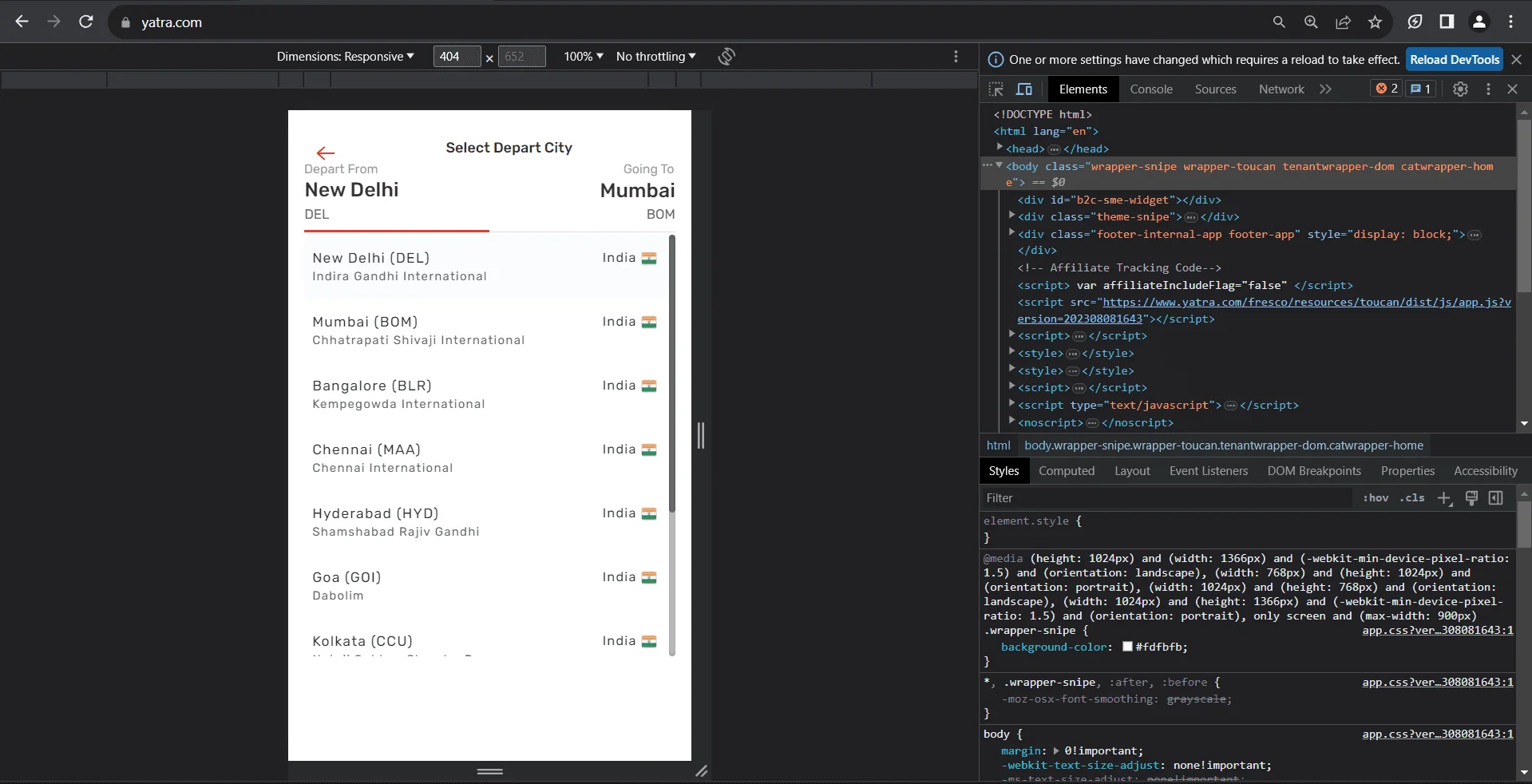
How to test mobile websites with Chrome DevTools?
1. Accessing DevTools:
● Launch the Google Chrome browser.
● Navigate to the website you want to test.
● Right-click anywhere on this page and select 'Inspect' from the context menu. Alternatively, you can press Ctrl + Shift + I (or Cmd + Option + I on Mac) to open DevTools.

2. Switch to mobile view:
● In the DevTools window, find the icon that looks like a phone and tablet, located in the top-left corner. This is the 'Toggle Device Toolbar' button. Clicking on it will switch the browser view to a mobile viewport.

● Once clicked, you'll see the website displayed in a mobile view format.
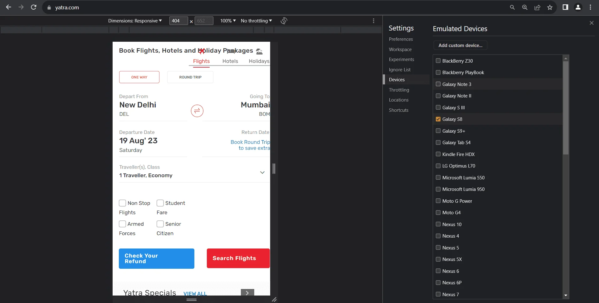
3. Selecting a device:
● You will receive a panel on Chrome DevTool where you will get options such as
- Dimensions
- Inbox for putting dimensions manually
- Zooming options
- Network throttling
- Rotate option
● Click on the first option, “Dimensions,” to get the dropdown menu for different emulated devices. You will get the entire list of devices if you click the “Edit” option.
● If you need custom dimensions, you can manually input those in the width and height fields next to the dropdown.
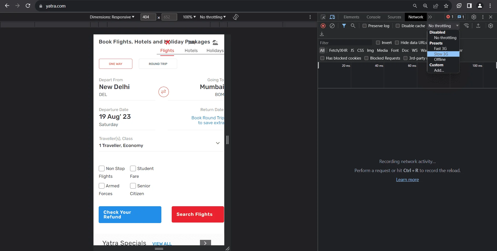
4. Emulating network conditions:
● Under the 'Network' tab in DevTools, you can simulate different network speeds. This is useful for understanding how your website performs under various connection conditions, such as 2G, 3G, or 4G.
● Simply click on the 'No throttling' dropdown and select a desired network speed.
5. Testing interactions:
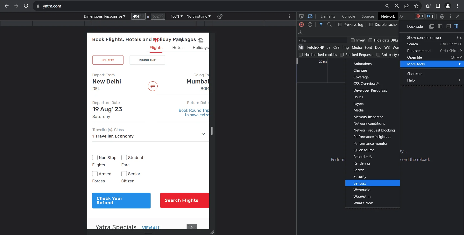
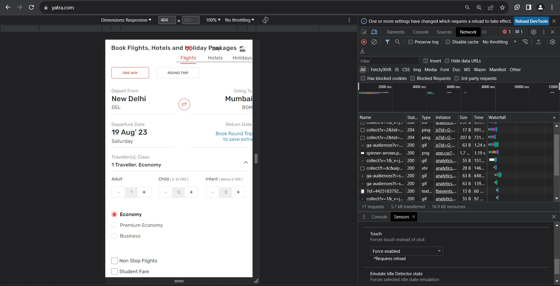
● You can simulate touch events using DevTools. This is crucial for testing websites with features like swipe gestures.
● To enable this, click on the 'three dots' (⋮) icon on the top right of DevTools, and navigate to 'More tools' > 'Sensors.' Then, in the ‘Touch' section, select 'device-based’ or ‘force enabled.’
6. Inspecting and modifying elements:
● Using the 'Elements' tab, you can inspect specific parts of the webpage, view their HTML and CSS, and make real-time edits to see how changes might look. This is helpful for quickly identifying and fixing responsive design issues.
7. Checking console for errors:
Switch to the 'Console' tab within DevTools. Here, you can see any errors, warnings, or logs that the website produces. Mobile-specific errors might appear when in mobile view, helping you identify issues that might not show up on the desktop.
8. Simulating geolocation and orientation:
● To test location-based features, go to the 'Sensors' tab within 'More tools.' Here, you can set custom geolocation, or use presets like 'Berlin' or 'San Francisco.' Additionally, you can emulate device orientation, which is useful for testing features that respond to device movement.
9. Auditing with Lighthouse:
● Chrome DevTools integrates Lighthouse, a tool that provides automated audits for performance, accessibility, progressive web apps, and more.
● Navigate to the 'Lighthouse' tab, select the mobile option, and run the audit to get a detailed report on the mobile performance and optimization suggestions.
Also check: How Does Geolocation Testing Help Deliver Flawless Websites and Mobile Apps?
Leveraging real device cloud to test mobile websites’ performance—using HeadSpin
Using a real device cloud to test mobile websites ensures authentic user experience validation, eliminates device-specific quirks uncaught by emulators, and offers scalable testing across a vast array of devices and OS combinations without hefty investments in hardware.
Utilizing a real device cloud to test mobile websites streamlines businesses' testing processes, ensuring optimal mobile user experiences while maximizing cost-efficiency and broadening market reach.
With the global device infrastructure, HeadSpin offers access to thousands of real SIM-enabled devices for QA teams to seamlessly test mobile websites and apps to monitor performance across several custom KPIs. HeadSpin’s AI-based testing insights help testing and QA teams evaluate the intricacies of the target app or website performance and deliver perfect user experience.
Following are the steps to perform the tests:
1. Browse to the remote control tab on the Platform
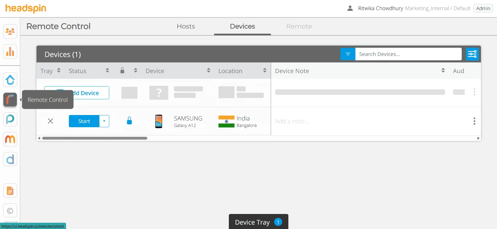
2. Choose the device you wish to run the test from and click on the ‘start’ option adjacent to the device, as in the image.
3. As the device opens up in the left-hand side panel, you can browse the website for testing and choose the ‘start recording’ option on the right-hand side.

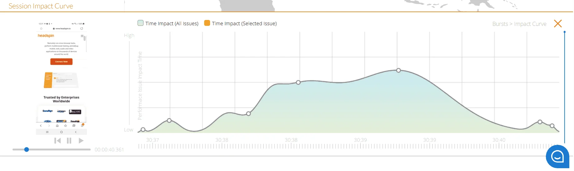
4. As you browse through different functionalities on the website, the Platform captures and measures multiple performance and user experience KPIs. Once the test is complete, you can stop recording the session from the same button and view the entire session timeline, waterfall, and burst UI.
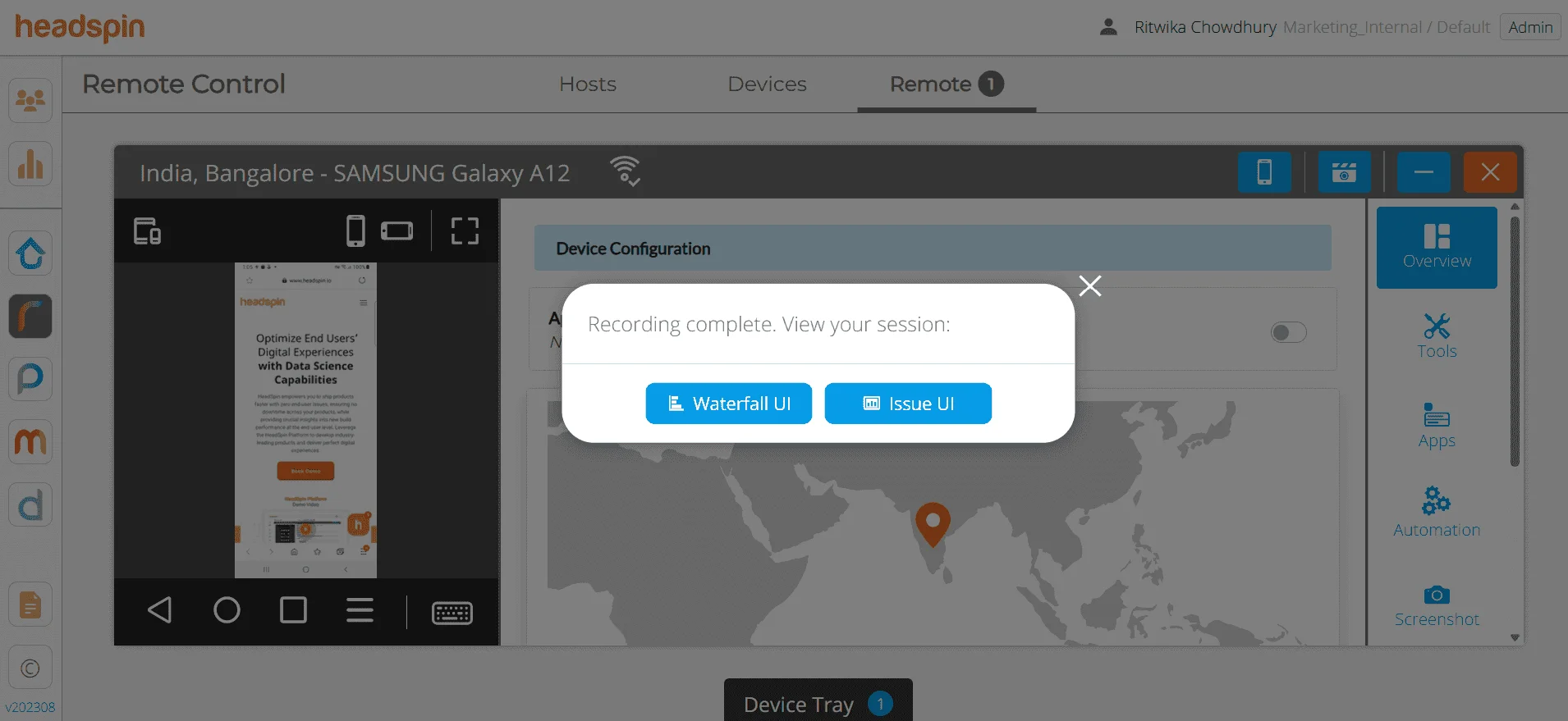
With all issues captured and suitable recommendations offered to resolve the issues proactively.
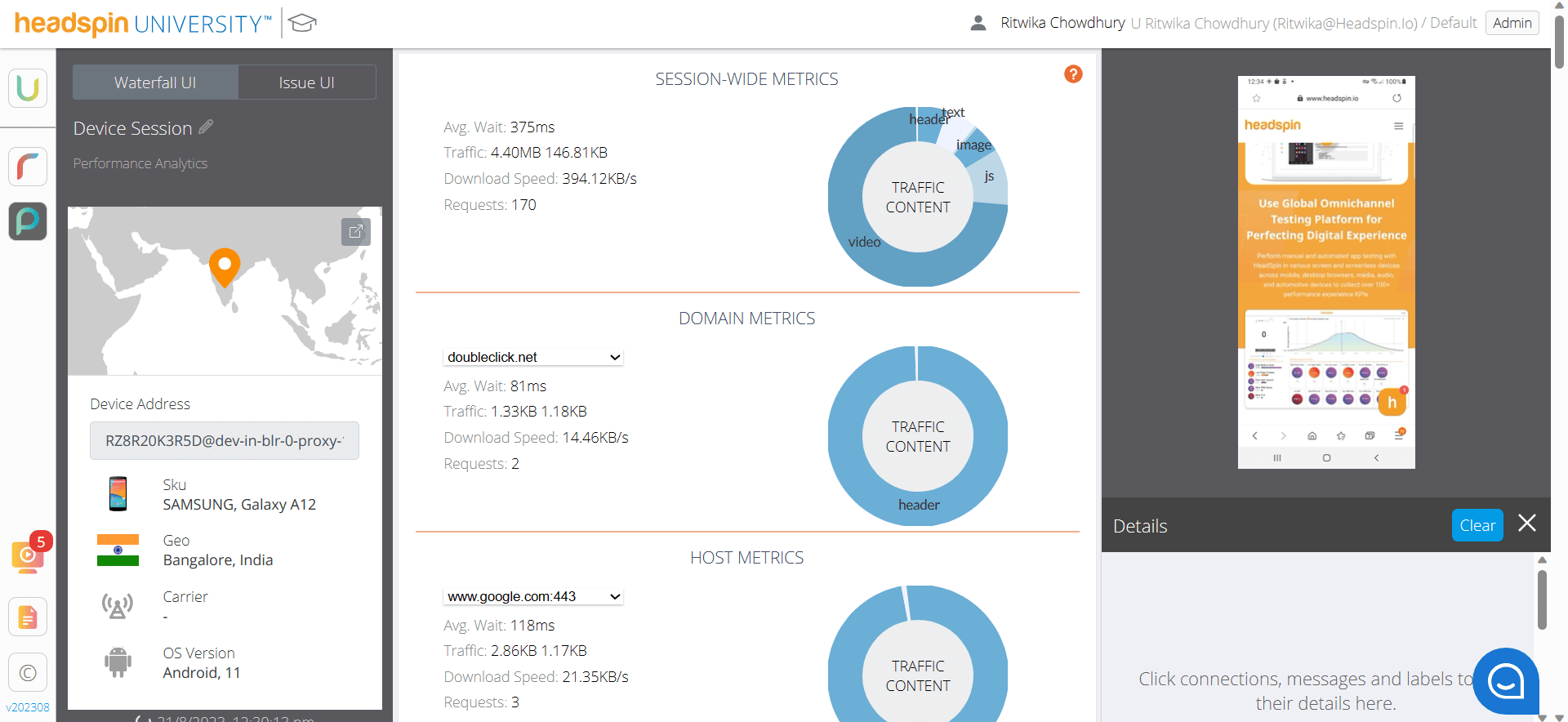
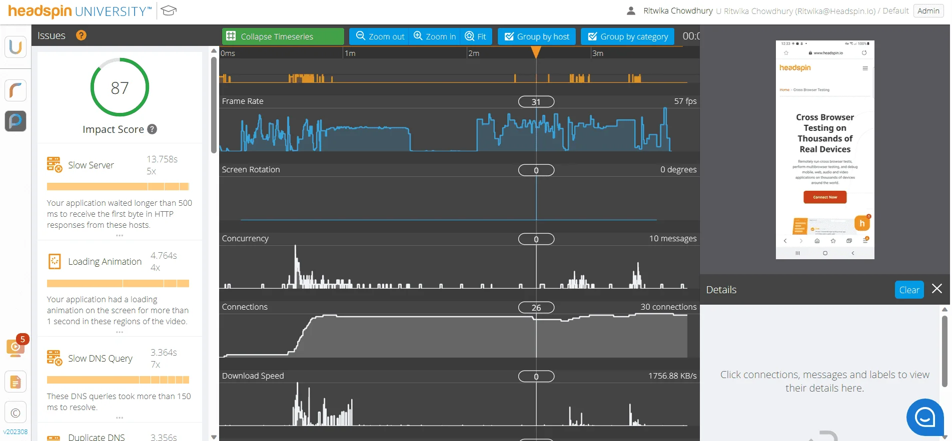
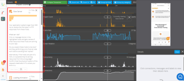
Teams can scroll over the timeseries to get detailed insights into the KPIs like slow server, loading animation, Slow DNS Query, low page content, slow downloads, duplicate messages, and many other KPIs.
5. Clicking on each issue in the left-hand panel gives a detailed insight into the root cause of the issue and resolutions for them.
An overview for browsing across the captured test session
%2520(1).gif)
How to test websites on mobile using emulators and simulators?
Emulators and simulators play a crucial role in mobile web testing. They offer a virtual environment that mimics the behavior of physical mobile devices, providing a cost-effective and efficient way to conduct mobile device website testing on a variety of device configurations. Here's a step-by-step guide on how to execute mobile website testing using emulators and simulators:
Selecting the right tool:
Emulators are virtual devices that run the actual mobile operating systems. They mimic both the software and the hardware behavior of the target device.
Simulators, on the other hand, do not replicate the device's hardware. They merely "pretend" to act like the device.
Examples of popular tools are Android Studio's built-in emulator for Android devices and Apple's Xcode simulator for iOS devices.
Setting up the emulator or simulator:
- Installation:
- For Android: Download and install Android Studio. During the installation process, you'll have the option to install the Android emulator.
- For iOS: Install Xcode from the Apple App Store. The simulator is integrated into the software.
- Configuration:
- Launch the respective tool and navigate to the emulator or simulator settings.
- Choose the specific device model, OS version, and other characteristics you want to test against.
Launching the emulator or simulator:
- Start the chosen virtual device from the list.
- Wait for the OS to load. It will resemble booting up an actual device.
Navigating to your website:
- Most emulators and simulators come with built-in browsers.
- Open the browser app on the emulator or simulator and navigate to the website you want to test.
Testing responsive design:
- Adjust the screen resolution, size, and orientation (portrait or landscape) to ensure the website adjusts and scales appropriately.
Interactivity and features testing:
- Interact with the website, testing features like forms, buttons, sliders, and other interactive elements.
- Emulators might offer simulated gestures such as swiping or pinching to help you test these functionalities.
Network and performance testing:
- Emulators and simulators may allow you to simulate different network conditions. This lets you test how your website behaves under various network speeds and disconnections.
Checking for errors and inconsistencies:
- Be on the lookout for any layout issues, broken links, or malfunctioning features. Since emulators/simulators can't exactly replicate real-world conditions, it's essential to note any discrepancies and test them on real devices if possible.
Integration with testing tools:
- Many emulators and simulators can integrate with popular web testing tools. This allows for automated testing, capturing logs, and other advanced testing functionalities.
Shutting down and cleaning up:
- Once testing is complete, ensure you close the emulator or simulator properly.
- Clean up any data or settings if needed to ensure a fresh environment for your next testing session.
Automated mobile website testing tools enable businesses to swiftly identify and rectify site issues, enhance user experience consistency across devices, and streamline the testing process, thereby accelerating product deployments and reducing manual intervention costs.
Read: A Complete Guide to Web App Testing
Performing mobile website testing with automation tools
Here's a generalized sequence of steps to follow when conducting mobile website testing using automation tools:
Steps for mobile website testing with automation tools—
● Requirement analysis:
Understand and document the specific requirements and objectives of the testing process. This step helps to determine what needs to be tested and the expected outcomes.
● Choose the right automation tool:
Select an automation tool that aligns with your requirements and supports the platforms and browsers you intend to test. Examples include Selenium, Appium, and WebDriver.
● Setting up the testing environment:
Configure the testing environment by setting up the automation tool, integrating necessary plugins, and ensuring connectivity with devices or device clouds.
● Script creation:
Write test scripts or scenarios for the aspects of the website you wish to test. This may include navigation, form submissions, responsiveness, and other user interactions.
● Test execution:
Run the test scripts. This can be done across multiple devices, screen resolutions, and orientations simultaneously, depending on the tool's capabilities.
● Analyze results & report:
After execution, review the results generated by the automation tool. Identify any errors, discrepancies, or performance issues.
● Optimize test scripts:
Refine and optimize test scripts based on feedback from the test results. Remove redundancies, add additional test scenarios if necessary, and rectify any issues in the scripts themselves.
● Continuous integration:
Integrate the automation tool with a continuous integration (CI) system like Jenkins, Travis CI, or CircleCI. This enables automatic testing whenever there's an update or change in the website's codebase.
● Routine maintenance:
As the mobile website evolves, update the test scripts to accommodate new features, changes, or removals.
● Feedback loop:
Create a process where issues detected by the automated tests are communicated back to the development team for rectification. This ensures continuous quality improvement.
Conclusion
Mobile website testing is crucial in today's digital landscape. Ensuring a seamless experience across devices is key to meeting user expectations and driving digital success. Through strategic testing, businesses can consistently deliver top-notch mobile web experiences.
FAQs
Q1. What's the difference between mobile website testing and mobile app testing?
Ans: Mobile website testing focuses on ensuring web pages render and function correctly in mobile browsers, while mobile app testing evaluates the functionality and performance of native or hybrid mobile applications installed directly on devices.
Q2. How can I ensure a website is accessible to users with disabilities on mobile devices?
Ans: Use accessibility testing tools like AXE or WAVE in conjunction with mobile emulators to evaluate and ensure compliance with mobile accessibility standards, such as WCAG 2.1.
Q3. In CSS, how can I ensure styles target only mobile devices?
Ans: Following is the code snippet for this:
@media screen and (max-width: 480px) and (pointer: coarse) {
  /* Styles for touch-based mobile phones */
}

Table of Contents


-1280X720-Final-2.jpg)


